Reading time: 36 minute(s) @ 200 WPM.
Introduction
Web mapping is an application of geographic information systems (GIS) that involves the creation of interactive digital maps displayed and manipulated through a web browser. To quote from Wikipedia:
The advent of web mapping can be regarded as a major new trend in cartography. Until recently cartography was restricted to a few companies, institutes and mapping agencies, requiring relatively expensive and complex hardware and software as well as skilled cartographers and geomatics engineers.
Web mapping has brought many geographical datasets, including free ones generated by OpenStreetMap and proprietary datasets owned by Navteq, Google, Waze, and others. A range of free software to generate maps has also been conceived and implemented alongside proprietary tools like ArcGIS. As a result, the barrier to entry for serving maps on the web has been lowered.
Some examples of web maps include:
- The Mayoral Primaries
- Washington: A world apart
- Flickr
- Donut holes in international waters
- Trip Risk
- Why not the best?
This post examines several approaches to creating and serving1 interactive web maps, focusing on free and open-source software tools. Some technologies involve desktop GIS software or programming environments as part of the workflow leading to a web map, while others are completely cloud-based and do not require installation of local software. Examples range from point-and-click, drag-and-drop interactive mapping environments, to mapping applications that write the code for you, to those where you need to have some coding skills (but are then rewarded by being able to do pretty much whatever you want).2
GIS in a nutshell
A GIS is a computerized system that links graphical map displays with data. The data are usually in a spreadsheet-like format, with a one-to-one correspondence between rows of the data table and features on the map.
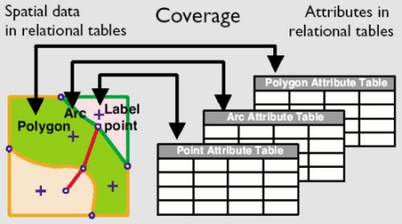
For example, a GIS map of the United States might have a data table (usually called an “attribute table” in GIS parlance) with 50 rows, one row for each of the 50 states. The attributes in the table (or columns, also called “variables” by the statistically-inclined) might be measurements of population size, median income, number of Subarus, political affiliation, and basically any item of interest that can be related to the map features (states in this example). The map itself would display the geographic boundaries of the states.
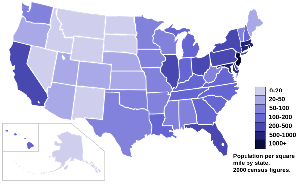
If we wanted to create a chloropleth map showing the population of each state, we would tell the GIS software to apply the population column of the attribute table to the map of state boundaries. The GIS would then read the data corresponding to the population of each state, apply a color scale to the data, and display the map with each state colored according to its population.
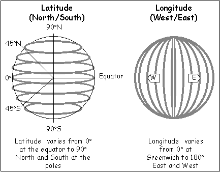
Coordinate systems are a critical feature of all GIS software, whether it be a desktop application running on a personal computer or a web-based mapping application like Google Maps. Coordinates (longitude and latitude) allow any feature to be precisely located on the surface of the earth. In terms of your high school geometry class, think of a graph. The X-direction, longitude, is west to east, or horizontal. The Y-direction, latitude, is north to south, oriented 90 degrees from the X-direction. The only difference between your high school graph and the earth is that the earth is a three-dimensional, roughly spherical planet instead of a flat piece of paper. Longitude and latitude are measured within some agreed-upon reference system, called a datum. In web mapping the units of measurement for longitude and latitude are usually decimal degrees.
Coordinates are what put the “geographical” in a geographical information system. Without a coordinate system, a GIS is just a regular database. In the geographic coordinate systems used for web mapping, longitude is measured from the Greenwich meridian, and latitude is measured from the equator.3
Having a common coordinate system allows GIS software to overlay multiple layers of information on the map, and to analyze relationships between the layers.
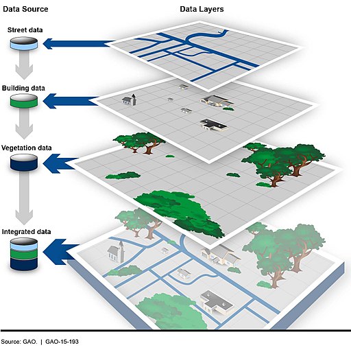
Map features fundamentally are either points (e.g., houses), lines (e.g., rivers), or enclosed areas or polygons (e.g., state boundaries). All maps, as most people know them, are composed of combinations of these three basic feature types. For example, if you wanted to make a GIS map showing rivers, lakes, and locations of wells, you could use three layers: one for rivers (lines), one for lakes (areas), and one for well locations (points).
Each layer would need to have the same geographic coordinate system (e.g., latitude and longitude in decimal degrees), which would then allow the GIS software to correctly overlay the three layers so that everything lined up correctly. An advantage of organizing digital map layers in this way is that you are then able to turn layers on and off, which is helpful in displaying and interpreting the mapped data.
While attribute data are usually in the traditional row-column format of a spreadsheet table, the map data can be in any of numerous formats. Two broad classes of GIS data are raster and vector.
Vector data comprise the three types of map features mentioned above: point, line, and polygon. Vector features are made up of one or more coordinate pairs (latitude and longitude). A point feature is represented by a single coordinate pair, a line feature is a series of coordinate pairs, and an enclosed polygon is basically a line feature in which the starting and ending points are the same. The GIS software then “connects the dots” to draw the map features. The greater the number of coordinate pairs that make up a vector feature, the greater the resolution that can be produced (e.g., smoother lines).
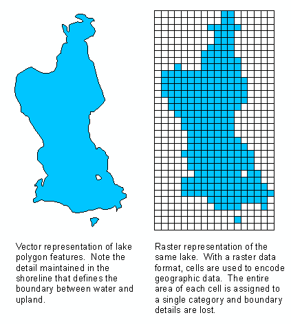
In contrast, raster data are rectangular (usually) arrays of pixels, in a row-column format. The geographic location of each pixel is established by its row and column designation, which is also attached to a corresponding latitude-longitude coordinate pair. In addition to its coordinates, a raster pixel also has one or more attribute values, such as an elevation or land-use type. Thus the value of a raster pixel could be a number (e.g., elevation) or a category (land-use type, political affiliation, etc.).
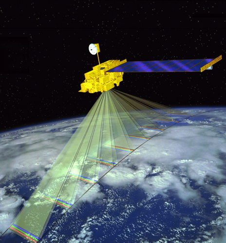
Images of the earth’s surface, obtained from satellites or aircraft, are a common type of raster data used in GIS.
When creating a web map, one starts by obtaining a base map, which is often composed of a mosaic of individual raster images, called tiles. Online mapping applications such as Google Maps and OpenStreetMap provide base maps composed of raster tiles streamed and assembled from a server.4 Additional features are then added to the base map, either interactively within a web mapping application or by providing data files that contain series of geographic coordinate pairs that produce points, lines, or polygons. Attribute data can also be associated with vector features so that the web map can be styled according to the map maker’s needs.
Desirable features of a web mapping platform
Given the foregoing, we list some of the desirable features of a web mapping system:
- A variety of readily-available base maps (e.g., standard map, satellite imagery, topography).
- Ability to accept user data in common formats (e.g., plain-text CSV,5 Google Sheets, Excel).
- Ability to import GIS vector layers in a variety of formats (such as shapefiles and KML files).
- Ability to create multiple map layers, to turn them on and off, zoom and pan, etc.
- Ability to customize the map with no limits.
- Free web hosting (because a web map has to be on the web).
As we will see, it is entirely possible to accomplish all of the above without spending any money, although you will have to invest some time in learning a bit of technology.
Set up your data for mapping

A common format for computer data files is comma-separated values, or CSV for short. A CSV file contains only plain text and can be created manually using a plain-text editor. DO NOT attempt to create a CSV file with a word processor (Microsoft Word, LibreOffice, etc.) because word processors insert invisible formatting characters into the file that will prevent the data file from being read by your mapping software. Many spreadsheet, database, and statistical applications can create CSV files as an option of their export function. An advantage of plain-text CSV files is that they are universal and can be created, read, and written by any computer in the known universe, without the need for proprietary software such as Microsoft Excel.
In a CSV file the first line contains column names (variable names), all separated by commas. Subsequent lines contain the data values, in the same order as the variable names, again with everything separated by commas (hence the name). Tradition dictates that CSV files are named with .csv as the file name extension, e.g. TheData.csv. When a CSV file is read into a spreadsheet or statistical application it produces the familiar row-column tabular format:
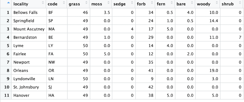
In the examples that follow we will use a CSV file to bring external data into the web mapping environment for the purpose of plotting locations on the base map and for associating additional data with those locations. Any type of numerical or character data can be stored in a CSV file, but for web mapping there also must be two variables that contain the latitude and longitude of the point locations. The latitudes and longitudes need to be in decimal degrees, and it is a good idea to name the variables something easily recognizable as coordinates, such as latitude and longitude, lat and lon, and so on.
The following is our map-ready CSV file, from a study in field ecology that is described in Habitat structure and phenotypic variation in the invading butterfly Coenonympha tullia. The structure of this data file (the metadata) is described here.
locality,code,grass,moss,sedge,forb,fern,bare,woody,shrub,lon_utm,lat_utm,lon_dd,lat_dd,fwlength,thorax,spotting,rfray,rhray,n
Bellows Falls,BF,46,3.5,0,34,.5,4,10,0,703877,4784632,-72.49113,43.18695,15.8,3.6,1.6,1.6,1.4,62
Springfield,SP,49,0,0,24,1,.5,14.4,0,707151,4793906,-72.44740,43.26949,16.0,3.7,1.1,2.0,1.5,51
Mount Ascutney,MA,49,0,4,17,5,0,0,0,708310,4806931,-72.42819,43.38634,16.2,3.8,1.2,1.9,1.6,58
Bernardston,BE,49,1,0,29,0,0,11,7,696647,4725212,-72.60087,42.65425,16.7,3.7,1.4,1.8,1.6,27
Lyme,LY,50,0,0,14,4,0,0,0,729474,4856926,-72.14600,43.82977,15.6,3.6,1.1,1.8,1.3,52
Fairlee,FA,50,5,0,12,0,2,0,0,729045,4868779,-72.14624,43.93649,15.9,3.8,1.0,1.8,1.5,25
Newport,NW,49,0,0,35,0,0,0,0,724169,4977885,-72.15977,44.91907,16.7,3.7,1.1,1.8,1.3,21
Orleans,OR,49,0,0,41,0,0,19,0,723193,4960641,-72.17970,44.76433,16.1,3.8,1.4,1.9,1.7,41
Lyndonville,LN,50,0,0,9,0,0,3,0,734359,4935471,-72.05029,44.53447,16.0,3.7,1.4,1.9,1.7,52
St. Johnsbury,SJ,49,0,0,42,0,0,0,0,734215,4925655,-72.05655,44.44626,15.7,3.6,1.2,1.9,1.7,56
Hanover,HA,49,0,0,38,5,0,5,0,715984,4843575,-72.31896,43.71376,16.0,3.6,1.2,1.8,1.8,65
The above data can be downloaded as a CSV file. The plain-text file (sites.csv) can be opened directly in Microsoft Excel, LibreOffice Calc, and other spreadsheet-like applications, and can also be imported into most (if not all) statistical and graphical software packages.
Google Maps
When you say “web mapping,” usually everyone thinks “Google Maps.” While not as flexible as the other web mapping tools that we will examine, Google Maps does provide a decent, cloud-based, interactive platform for putting your data onto a web map.
If you point your web browser to maps.google.com,6 you will see the usual Google Maps interface, where you can search for places, get directions, etc. But the key to creating your own customized web map in Google Maps is “Your places,” found by clicking the Menu icon in the upper-left corner of the Google Maps page:

In the expanded menu that appears, click Your places, then click Maps, and then click See All Your Maps. You will then be brought, finally, into My Maps. Click the large button that says CREATE A NEW MAP. You should then see something like this:
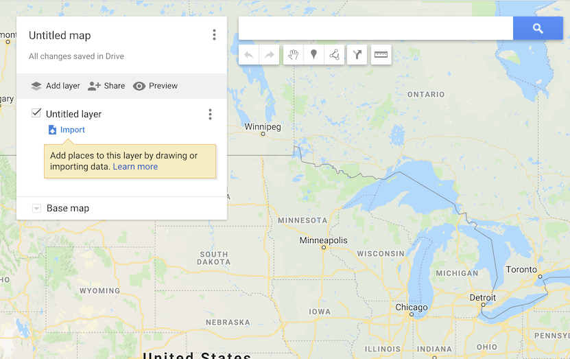
This is the canvas upon which you can create your web map. You should immediately give your map a name by clicking on Untitled map and typing in a name for the map plus an optional description.
You can choose among nine different base maps, including a standard map, satellite, and topography, by dropping down the Base map menu and selecting the base map that you want. Google Maps lets you choose two different base maps (although this does not seem to be documented), and gives the user the option to alternate between the two while viewing the map. You choose base maps by simply clicking on two different base maps in succession, and Google Maps remembers the ones you have selected.
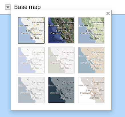
Google Maps automatically creates a map layer overlain onto the base map, called Untitled layer. You can rename the layer by clicking the three-dots menu to the right of the layer name. You can add features (points, lines, polygons) to your layers either by drawing them interactively, or by importing data (discussed shortly).
Use the toolbar, located beneath the search bar, to draw new features.

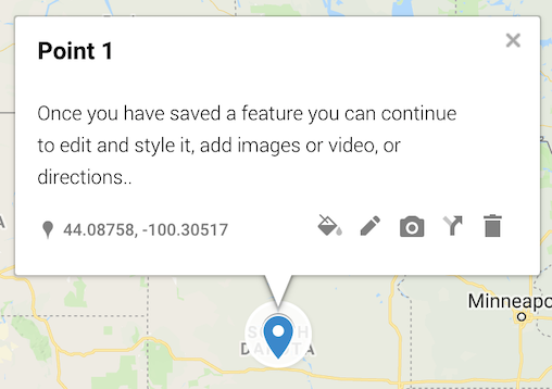
To add a point, click the Add marker tool, and to create a line, click the Draw a line tool. There is no separate drawing tool for adding a polygon; instead, use the line tool and just connect the two ends to create an enclosed polygon. After creating a feature you have the opportunity to add information to a popup window that appears when the user clicks the feature. You can also edit this information, adding an image, styling, and other annotations.
You can add additional layers by clicking the Add layer button and adding features as just described. Users of your map will see a map legend that shows all layers, each with a checkbox for turning the layer on or off. Clicking the Preview button will show you what your map will look like to a user.
Besides drawing features manually, you can add features to your Google Maps layers by importing GIS data stored in a file (see Import map features from a file). Google Maps can accept feature data contained in CSV files, Excel files, Google Sheets, KML files, and GPX files (a file format produced by GPS devices such as route trackers and mobile phone apps).
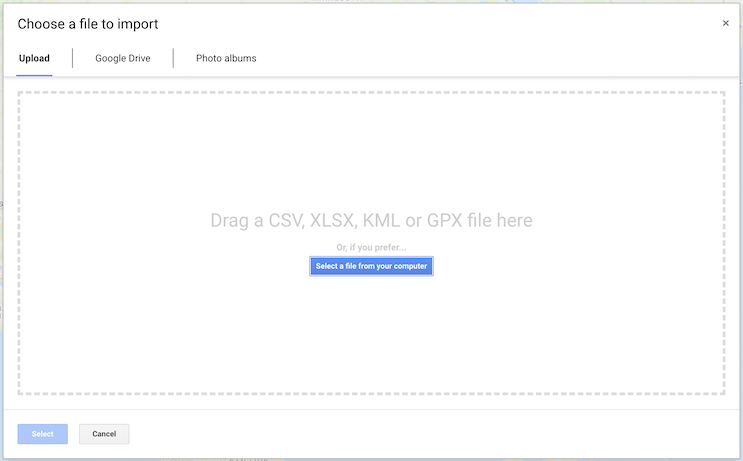
We will add features from (1) our sites.csv file, and (2) a KML file containing polygon boundaries of Massachusetts, Vermont, and New Hampshire, which can be downloaded here. To do this, first create a new Google Map by clicking the CREATE A NEW MAP button. Rename the Untitled layer to Sites. Then, in the Sites layer, click the Import link. Using the Choose a file to import dialog that appears, drag in (or select) the sites.csv file that you have previously downloaded from here.
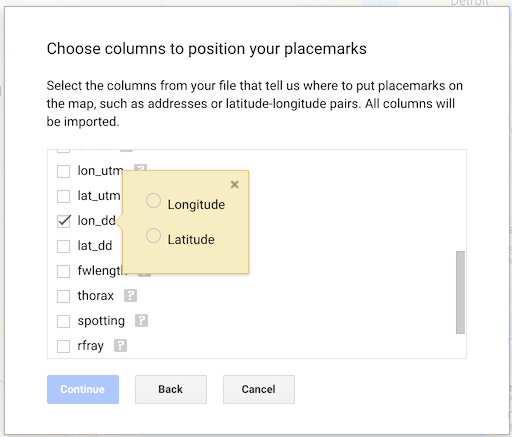
After the file is uploaded, you have to choose the columns (variables) containing your geographic coordinates. Choose lon_dd for longitude and lat_dd for latitude. (Both variables are in decimal degrees.)
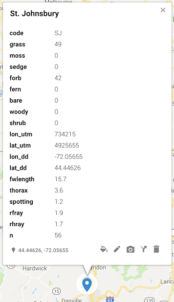
You then have to choose a variable to use as the label for the locations; choose the locality variable. Click Finish, and you should then see 11 point locations arranged in a line running south to north along the Vermont-New Hampshire border. Next, click the Preview button, and you will see what the map would look like to a user. There is a legend entry for Sites, with a checkbox that you can use to turn the layer on and off. If you click one of the markers, the side panel will display the name of the site (variable locality) along with all of the other data values for that site, from the sites.csv data file.
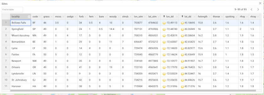
Back in edit mode (click the EDIT link in your map preview), click the 3-dot menu for Layer options in the Sites layer, and then click Open data table. You will see a spreadsheet containing all of the data that you uploaded. This is the attribute table for your point feature layer.
(Click image to enlarge.)
Each row of this table corresponds to one of the point locations in the Sites layer. If you select a row by clicking the left-most cell, containing the row number, the corresponding site will be selected on the map. This demonstrates the one-to-one correspondence between rows of the attribute table and features on the map. To the right of each column name is an arrow that will open a drop-down menu containing various options for manipulating the data. These options include deleting the column (which is not allowed for your latitude and longitude columns). Columns that you delete are gone forever, so use care. But you can use the ability to delete columns to control what data are displayed in the popup that appears when a marker is clicked.
It would be nice to highlight the outlines of the three states that surround the point locations. State boundaries are contained in the KML file vtnhma.kml, which can be downloaded using the link provided above. Go back into Edit mode and add a new map layer named States. Click the Import link and add the KML file as we did for the sites.csv file. When the file finishes uploading you should then see the outlines of Massachusetts, Vermont, and New Hampshire overlain onto the base map, with a new legend entry that shows the names of the three features (the individual state boundaries).
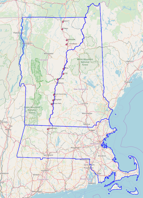
Your map should now look something like this:
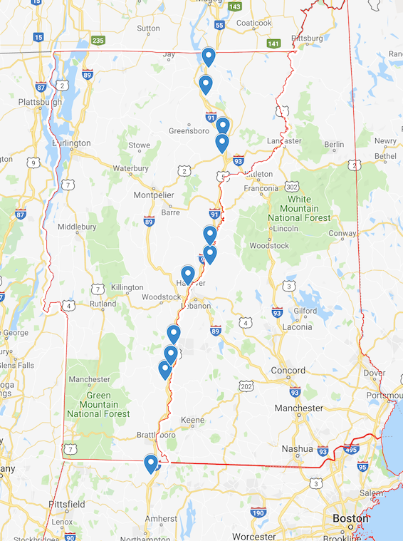
The KML file was created using data layers provided for free by the U. S. Census Bureau (Cartographic Boundary KML Files - States). The layer cb_2017_us_state_500k.zip was downloaded, unzipped, and brought into QGIS, a free desktop GIS application that we will explore shortly. The three state boundary polygons were extracted from the country-wide state layer and exported into their own KML file, the vtnhma.kml that we brought into Google Maps. Desktop GIS applications can thus be used to obtain and prepare data layers that can then be used in web maps, something we will do in the next section.
A powerful feature of Google Maps is that they can be shared just like any other Google document type (Google Docs, Google Sheets, Google Slides, etc.). In Edit mode of your map, click the Share link.
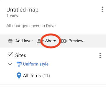
You can then either share your map with the entire internet, within your institution, or only share it with specific people. You can give specific people editing rights for the map, or you can restrict them to just being able to view the map. This is a great collaboration tool for creating a team-built map.
Google Maps is probably one of the easiest ways to create a web map, because it is readily available, free to anyone with a Google account, and it does not require any coding. It accepts a decent range of data types, and as long as you stay within its limits, provides a very serviceable web mapping platform.
Speaking of limits, Google My Maps limits you to 2,000 features per layer, and 10,000 features per map, with a maximum of 10 layers per map. Additionally you can import a maximum of 2,000 data rows, and there are also some file size restrictions; see this link for more details. Furthermore, you can only import data once per layer. So if you have already added features to a layer, either by hand or by file import, you can no longer import data to that layer; you will have to create a new layer in order to import more data. As yet another limitation, it is not possible to export your layer data tables out of Google Maps and into Google Spreadsheets, Excel, or a delimited text file. However, you can export your map to a KML or KMZ file, which can then be opened and viewed in Google Earth.
A very nice Google Maps Cheat Sheet (PDF) can be found here.
St. Olaf College has an excellent tutorial on Google My Maps, that shows a few more details and map tricks than we have discussed here (such as using place names to position map markers instead of having to provide latitudes and longitudes). They also show how to generate HTML code to allow you to embed your Google Map in Moodle, WordPress, and other HTML pages.
QGIS and the qgis2web plugin
Our next example of creating a web map uses the QGIS desktop GIS application with the qgis2web plugin. QGIS is a free, open source geographical information system and runs under macOS, Microsoft Windows, Linux, or Unix. To install QGIS on your computer, visit the QGIS website, using the above link. Click the Download Now button and follow the instructions for your particular computer operating system. You will download an installer program or package, which you will then run to install QGIS on your machine. The installer application presents you with a series of instructions to follow. Depending on your computer platform, there may be several required packages that must be installed first before you run the final package that installs QGIS. Be sure to read any Readme files before you start the install procedure.
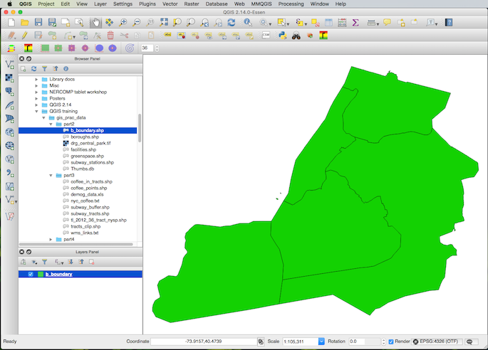
The QGIS interface looks basically the same regardless of what computer platform it is running on. There is a large main window, or “canvas,” where the map is drawn. The left-hand window by default contains a Browser Panel that shows your computer’s filesystem, and a Layers Panel for the various data sources that comprise the layers of your map. Along the left edge of the Browser Panel is a series of icons for adding common data sources. The top of the QGIS application window is occupied by an additional series of menus, toolbars, and icons.
QGIS is a comprehensive GIS application for creating, editing, visualizing, analyzing, and publishing geospatial information. Here we are focusing specifically on how to use QGIS to create a web map. The complete documentation for QGIS can be found here.
To use QGIS for web mapping you must also install the qgis2web plugin. A “plugin” is a chunk of software code that can be installed into a main application to add functionality. QGIS has many plugins, which can be viewed and installed from the Plugins menu:
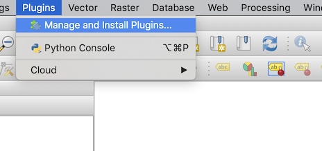
To install the qgis2web plugin, first click Manage and Install Plugins.... In the Plugins dialog box that appears, search for qgis2web. Click on the plugin name to select it, then press the Install plugin button. When you see the Plugin installed successfully message, close the Plugins dialog box. Then, click the Web menu, and you should see a menu item called qgis2web:

We will use the Create web map option of this tool to create a web map from data layers that we assemble using QGIS.
First, to create base map layers for our web map, we will use several XYZ tile servers, which provide raster image tiles that QGIS then assembles into a base map. To gain access to the tile servers, we will run a Python script inside of QGIS. Python is a programming language that is embedded in QGIS. Python allows you to extend the core functionality of QGIS as well as write scripts to automate your tasks. A Python script is a computer program that runs inside of QGIS, essentially a program running inside of another program.
The Python script that we will run is found here. When you click the link, the Python script will open in your web browser. Select and copy all of the code to your computer’s clipboard. Then, start QGIS. From the Plugins menu, click Python Console, which will open up QGIS’s Python language interpreter.
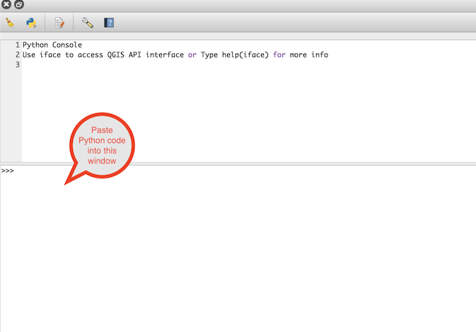
Place your cursor inside of the lower window and paste the Python code into the window. When the code finishes scrolling, your cursor should be positioned at the end of the last line of code. Then, press the Enter key to run the code. Assuming that the code runs successfully (e.g., no error messages are displayed), you should now see a series of tile servers listed under XYZ Tiles in your QGIS browser panel:
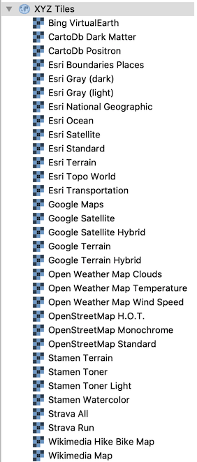
We will use three of these tile servers to provide our web map with three different base maps that can be turned on and off by the user. The OpenStreetMap Standard server will provide a standard map, similar to Google Maps but completely free and open-source. CartoDb Positron is a simplified, grey-scale map, and ESRI Satellite is a layer of satellite imagery. Simply click and drag these three servers, one at a time, onto the main map canvas of QGIS. It may take several seconds for the maps to appear, depending on the speed of your internet connection.
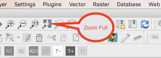
When the three base layers have been added, click the Zoom Full icon in the QGIS Map Navigation Toolbar to zoom the map canvas out to the full extent of the layers.
You will find that the Layers Panel now has three entries, one for each base map:
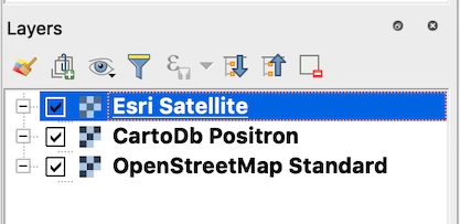
You can turn the layers on and off by checking and unchecking the check boxes to the left of each layer. Also note the checkerboard-ish icon to the left of each layer name, which indicates that the layers are raster data sources.
Next we will add our point location features contained in the sites.csv file, and the boundaries of Massachusetts, Vermont, and New Hampshire contained in the vtnhma.kml file. (You will recall that we used both of these files in Google My Maps.)
To add the sites.csv file to the map, use the Layer menu. Select Add Layer, then Add Delimited Text Layer.

In the dialog box that appears, click the button to select a file:
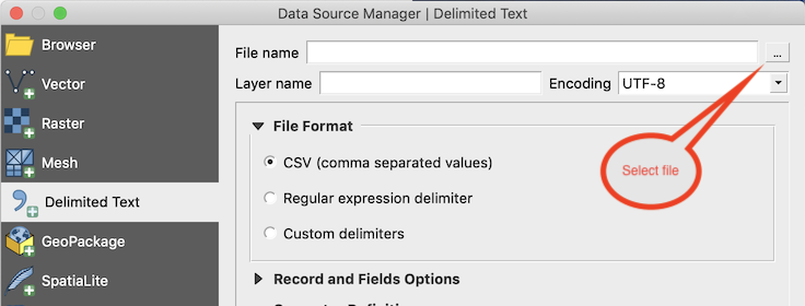
Navigate to the location of the sites.csv file, and select it. Next you will have to choose the two attribute table fields that contain the latitude and longitude coordinates in decimal degrees, under Geometry Definition. We will use the lat_dd and lon_dd fields, like we did for Google My Maps:
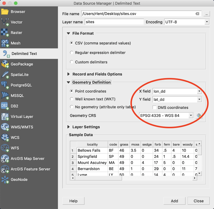
Geometry CRS is the coordinate reference system, and refers to the geodetic datum being used for the map. When we added the three base map layers from the on-line tile servers, our map assumed the datum being used by those base maps, which is WGS 84 (also known as EPSG:4326).
Under Sample Data you see a preview of what the attribute table will look like when it is imported; you can scroll through the data to check that it will be imported correctly. Then click the Add button, then Close.
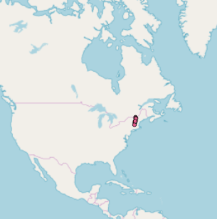
You should now see a blob of data points clustered in the New England region of North America. . .
. . . and the Layers panel should now show a new legend entry for the sites layer:
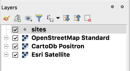
Note that the icon to the left of the sites layer name in the Layers panel indicates that sites is a point vector layer.
There are a couple of things to note about the Layers panel. The layers listed in the Layers panel are drawn from the bottom layer up. You can rearrange the order of the layers by dragging them around in the Layers panel and thus change the order in which the layers are drawn. So in the above layers panel I have rearranged the layers so that the ESRI Satellite layer is drawn first, then CartoDb Positron, next OpenStreetMap Standard, and finally the sites point layer is drawn on top of the previous layers. The effect of this arrangement is that, regardless of which base map layer is active, the sites layer will always be drawn on top. If sites was not the last layer to be drawn, it would be covered up by base map layers being drawn after it. So when using a GIS application like QGIS you have to think about the order in which you want your layers to be rendered. This will also be important for the web map that we will ultimately produce from QGIS.
Another feature of the Layers panel is that you can right-click a layer to produce a popup menu of additional options:
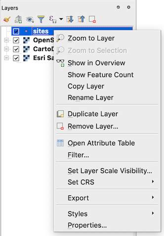
Right-click the sites layer, and choose Zoom to Layer. The map will zoom in to the full extent of the sites layer, so that all of the 11 sites fill the map canvas. Now that the map is zoomed in to our area of interest, we will add the three state boundaries contained in the vtnhma.kml file. Again using the Layer menu, select Add layer, then Add Vector Layer. In the dialog box that appears, under Source, navigate to the location of the vtnhma.kml file, and select it. Add the layer, then close the dialog. In the Layers panel, right-click the vtnhma layer and select Zoom to Layer so that the entire extent of the study area fits in the map canvas.
When you add a new layer to QGIS, the layer is added to the top of the list of layers in the Layers panel, such that it is drawn last. Therefore the vtnhma layer currently obscures the sites layer. To fix this, drag the vtnhma layer so that it comes immediately after the sites layer. Now the point locations of our study sites are visible on top of the state boundary polygons. However, by default QGIS has filled in the state polygons with a solid color. We will change this so that we just see the boundaries, without them being filled in.
To do this, right-click the vtnhma layer and choose Properties. This produces a large dialog box with a range of options for styling the map.
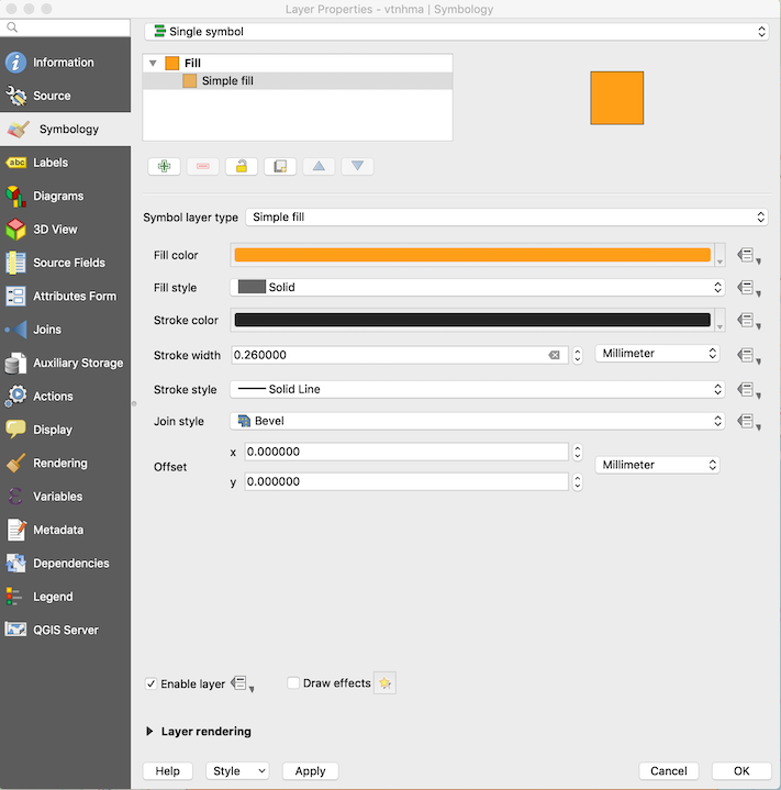
In the left-hand menu, click Symbology. This series of options controls how data are presented, or symbolized, on the map. Near the top of the dialog box, click Simple fill. The options in the rest of the dialog box will change to reflect the current settings for Simple fill, meaning how you want to fill the state polygons with a color. Where it says Symbol layer type, change this to Outline: Simple line. At the bottom of the dialog box is a button labeled Apply. You can click the Apply button to apply your changes to the map. Click Apply, and you will see that the state polygons change from being filled with solid color to being just the outlines of the state boundaries.
Next, click in the Color field and choose a blue-ish color for the state boundaries. Change Stroke width to 1.0. Click Apply to see your changes. The state boundaries should now be outlined with a fatter, blue line. Click OK to finish this series of changes to the vtnhma layer.
Your Layers panel should now be looking something like this:
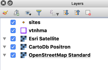
Note that the icon to the left of the vtnhma layer indicates that it is a polygon vector data source.
Now right-click the sites layer and again choose Properties. You will see the same Symbology dialog box, but this time it’s for the point locations. Near the top of the box, click Simple marker to choose the options for how you want the locations to appear on the map. Change the Size setting to 3.5, to make the point symbols a little bit larger.
Then, in the left-hand menu, click Labels. Change No labels to Single labels, and a whole bunch of labeling options will appear. Near the top of the box, where it says Labels with, choose the locality field. Click Apply and observe that the names of the sites now appear next to the point symbols. Click OK to close the Layer Properties box.
We are now finally ready to create our web map. But before proceeding, right click the vtnhma layer and choose Zoom to Layer. Your map should look something like this:
(Click image to enlarge.)
We will use the qgis2web plugin to convert the map layers we have assembled into an interactive web map, using the Leaflet web mapping library. By “library” we mean a collection of ready-to-use software functions that can be assembled into an interactive web map using a programming language. The Leaflet library is written in JavaScript, which is a core internet programming language. The qgis2web plugin generates the JavaScript code to create an interactive web map incorporating the GIS layers assembled in QGIS. So all of the QGIS work we have been doing up to now has been to prepare data layers to give to the qgis2web plugin. But qgis2web will do the work of generating the program code for us.
Using the Web menu, click the Create web map option of the qgis2web plugin:

At the bottom left of the Export to web map dialog box that appears, choose the Leaflet radio button:
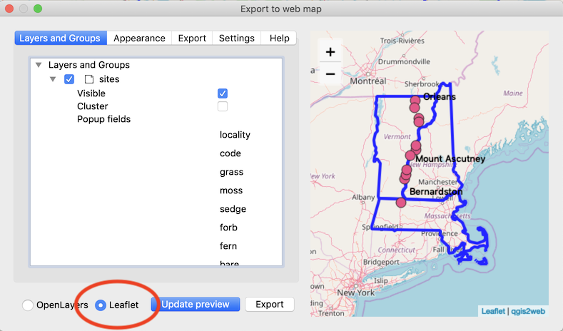
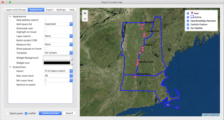
The right-hand panel shows the data layers that we have assembled, and how they will appear as a Leaflet web map. Click the Appearance button near the top left of the dialog box. In the left-hand panel, under Appearance, change Add layers list from None to Expanded. This will create a control in the Leaflet web map that lists all of the map layers and gives the user the ability to turn layers on and off. It essentially replicates the Layers panel of QGIS.
After you have changed Add layers list to Expanded, click Update preview at the bottom left of the Export to web map dialog, and you should see the right-hand map preview panel change to reflect your changes. The map layer control should now appear in the upper right-hand corner of the map. You can turn the layers on and off by checking and unchecking the check boxes next to each layer. Note also that there is a zoom control in the upper left-hand corner of the map. The map can also be zoomed by use of your mouse wheel, and you can also hold down the shift key and drag a zoom rectangle with the left button of your mouse.
While still in the Appearance settings, under Scale/Zoom, change Extent to Fit to layers extent, and then click Update preview. The preview map should zoom in to match the zoom level of the QGIS map canvas.
Your Export to web map dialog box should now look something like this:
(Click image to enlarge.)
We can now export this map composition to a standalone Leaflet web map that can be viewed in a web browser. While still in the Export to web map dialog, click the Export button. Under Data export, change Exporter to Export to folder, and then click the button with three dots to choose the export location on your computer’s filesystem. (The other Export option, Export to FTP site, allows you to place your Leaflet map directly on a web server. You need a web server account and valid login credentials in order to do this.) Once you have chosen an export location, click the Export button at the bottom left of the dialog box.
A folder will be created in the location that you specified, and the folder contents will look something like this:
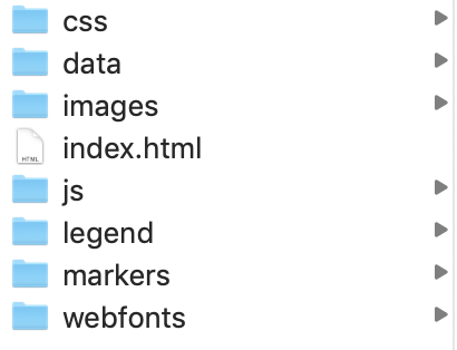
This folder, created by the qgis2web QGIS plugin, contains all of the HTML code, JavaScript code, fonts, data, images, and other resources needed to produce the web map. You can open the index.html file in a web browser, and your Leaflet web map will appear. You can give this folder to others and they can view the web map locally in their own web browsers. If you had instead exported the web map via FTP to a web server, you would then have a URL that you could distribute so that others could view the map.
To view this map running live from a web server, click here.
Note that when you click one of the site points in the web map, a popup appears containing the corresponding fields of the attribute table:
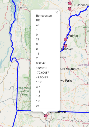
The fields that appear in the popup, along with other features of web map behavior, can be controlled within QGIS and the qgis2web plugin.
For more information on this and other aspects of using the qgis2web plugin, see Web Mapping with QGIS2Web.
RStudio and the R Leaflet Package
Our final web mapping example differs from the previous two because it requires coding in the R programming language. R is a free, open-source, cross-platform computing environment that is widely used in academia and industry, and is a leading programming language in the field of data science.
In this example we will learn enough R to produce a web map. For a more detailed discussion of R, see An Introduction to R. We will build our web map using RStudio, which is an integrated development environment for R that greatly facilitates working with R. The combination of R and RStudio is a very powerful computing platform for accomplishing a wide range of tasks (see, for example, RStudio as a Research and Writing Platform). Both of these tools are completely free.
The tradeoff of this approach when compared to that of other web mapping platforms is that you have to invest some time in learning how to write program code in R. But the reward for such effort is that you have complete control over the final product, with great freedom as to how much data you can map, number of map layers, etc. In addition, the use of R in conjunction with RStudio gives you access to free web hosting for your web maps, on a platform known as RPubs.
In the previous example we used QGIS with the qgis2web plugin to produce a web map using the Leaflet JavaScript library. The qgis2web plugin wrote the mapping code for us, but this time we will write it ourselves, using an R package that allows us to access the Leaflet JavaScript library using R instead of programming Leaflet directly using JavaScript. An R package is a modular chunk of code that can be installed in RStudio to give the system more functionality (like plugins with QGIS). The Leaflet package we will use with R is called, logically enough, Leaflet for R. Some advantages of this approach include:
- You don’t have to know JavaScript (but you do have to know a bit of R).
- You have all the power of R’s vast library of data wrangling, statistical, and graphical analysis routines to bring to bear on your web map.
- You have access to free web hosting, via RPubs, for your completed map (more on that later).
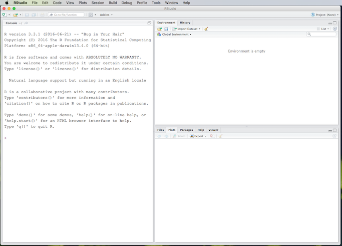
Instructions for downloading and installing R and RStudio can be found in the Software Installation section of RStudio as a Research and Writing Platform. To save time here, I will assume that you have successfully installed R and RStudio on your computer. Start RStudio, and you should see something like this:
(Click image to enlarge.)
The above screenshot is from an iMac, but Windows and Linux users should find it comparable to RStudio running on their systems. The Console window contains the R interpreter and is where you can enter and run R commands directly. Results of R computations are written to the console, and graphical results appear in the Plots or Viewer tabs.
However, instead of typing R programming statements into the console by hand and getting results interactively, the usual way to run R programs is to type the code into a text file, and then tell RStudio to run the file. We will create an interactive Leaflet web map completely from the following R code, all of which appears between the two horizontal lines.
# sitesmap2.R
# An interactive web map using the R leaflet package.

library(leaflet)
library(maps)
library(htmlwidgets) # To save the map as a web page.

# The data to map.
sites <- read.csv("https://richardlent.github.io/rnotebooks/sites.csv")

# State boundaries from the maps package. The fill option must be TRUE.
bounds <- map('state', c('Massachusetts', 'Vermont', 'New Hampshire'), fill=TRUE)

# A custom icon.
icons <- awesomeIcons(
    icon = 'disc',
    iconColor = 'black',
    library = 'ion', # Options are 'glyphicon', 'fa', 'ion'.
    markerColor = 'blue',
    squareMarker = FALSE
)

map <- leaflet(data = sites) %>%
    addTiles(group = "OpenStreetMap") %>% # Adds default OpenStreetMap base map.
    addProviderTiles("CartoDB.Positron", group = "Grey Scale") %>%
    addProviderTiles("Esri.WorldImagery", group = "Satellite") %>%
    addProviderTiles("Esri.WorldShadedRelief", group = "Relief") %>%
    addProviderTiles("Stamen.Watercolor", group = "Other") %>%
    addMarkers(~lon_dd, ~lat_dd, label = ~locality,
             popup = "<img src='https://richardlent.github.io/img/willie.png' height='149' width='112'>",
             group = "Sites") %>%
    # addAwesomeMarkers(~lon_dd, ~lat_dd, label = ~locality,
    #          popup = "<a href='https://www.rstudio.com/'>RStudio</a>",
    #          group = "Sites", icon=icons) %>%
    addPolygons(data=bounds, group="States", weight=3.5, fillOpacity = 0) %>%
    addLayersControl(
        baseGroups = c("OpenStreetMap", "Grey Scale", "Satellite", "Relief", "Other"),
        overlayGroups = c("Sites", "States"),
        options = layersControlOptions(collapsed = FALSE)
    )

print(map)
saveWidget(map, file="sitesmap2.html", selfcontained=TRUE)
If you are not used to working with program code, the above may seem daunting at first. But do not be afraid. We will first run the code in RStudio to produce the map, and then dissect the code line by line.
Download the code from here and save it to a place where you can find it easily on the computer where you have installed R and RStudio.
Start RStudio, then click the Files tab. This shows the filesystem of your computer. Navigate to the location where you have downloaded the R file (the name of which is sitesmap2.R). By convention, text files containing R programming code are named with .R as the filename extension.
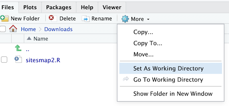
Click More next to the gear icon, and then click Set As Working Directory. This setting will make it such that any files created when we run our sitesmap2.R code will be placed in the same directory as the code file. This just makes things easier to keep track of. In the above image I have downloaded the sitesmap2.R file to my Downloads directory, which I have set to be the RStudio working directory.
Next, while still in the Files tab, click the sitesmap2.R file. This will open the file in the RStudio text editor. From the editor window we can modify and run the code. But before we do that, we have to install some R packages.
The first five lines (not counting blank lines) of R code look like this:
# sitesmap2.R
# An interactive web map using the R leaflet package.

library(leaflet)
library(maps)
library(htmlwidgets) # To save the map as a web page.
The first two lines begin with the # symbol; they are comments. Comments are ignored by the R language interpreter and are handy for writing material that documents the code. Comments can either be on their own line or on the same line as executable code, as long as the comment begins with the # symbol. (There is a whole science to writing programming comments, which we will not address here.)
The three lines that begin with library specify three R packages (a.k.a. “libraries”) that we want to access. The first package is the R leaflet package for creating our web map. The second package, maps, contains map boundary files. We will obtain the boundaries of Massachusetts, New Hampshire, and Vermont from the maps package, and thus do not need the vtnhma.kml file that we used in previous examples. Finally, the htmlwidgets package contains a function that will allow us to save our Leaflet web map to a map widget that is packaged into a standalone web page that we can then place on a web server.
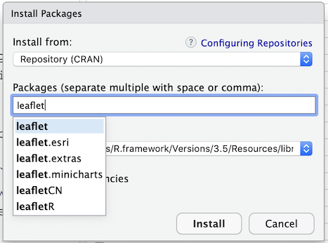
Before we can use these three packages in our program, we have to install them. Click on the RStudio Packages tab. This will list all of the R packages that are currently installed. Click on the Install button of the Packages tab, and type in the name of each of the three packages in succession (leaflet, maps, htmlwidgets). Install each of them, one at a time, making sure that Install dependencies is checked. This will ensure that any other required packages are installed. (R packages often depend on other packages in order to function properly.)
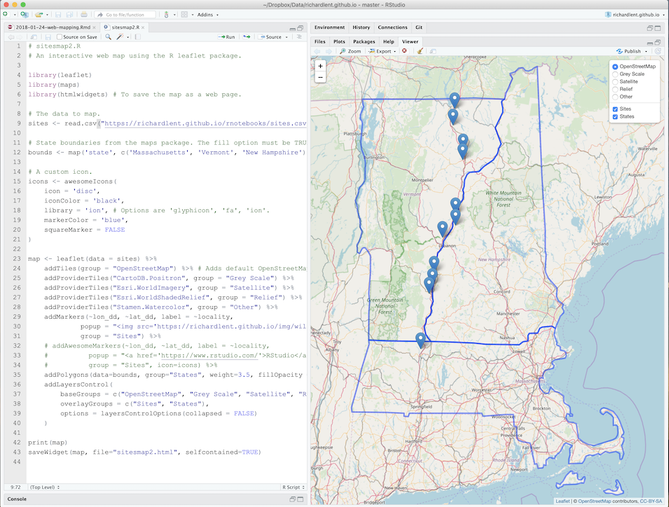
Now that the three packages are installed, we can run the code. In the RStudio editor, click the Source button. This will “source” the sitesmap2.R file, meaning that the file is being provided to R to run as source code. The R interpreter reads the code line by line and executes it. The Leaflet map should appear in the Viewer pane. RStudio should now look something like this:
(Click image to enlarge.)
You should also see another file, sitesmap2.html, that has appeared in your working directory:
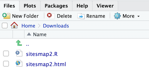
This is an HTML file that contains the Leaflet map. You can open this file in a web browser and view the same map that is displayed in the RStudio Viewer panel. You can also upload this file to a web server so that others can view your map. (Later we will see how you can upload the map directly from RStudio to the free web hosting platform RPubs that is provided by RStudio.)
This process for creating a web map is fundamentally different from that of either Google Maps or QGIS/qgis2web. The map was created completely from code that brought together the map layers, data, map controls, and map styling. We now will examine how this code functions. (Ha ha, a funny programming joke. Get it? Never mind.)
Wait, that was funny because of functions. The R language is built on functions, as are many other programming languages. A function is a chunk of program code that takes zero or more values, processes them, and returns a result.
Remember high school algebra class, in which we learned the basic formula for a function:
\[\huge f(x)\]
This is the (in)famous “f of x” function notation. Here, f is the name of the function and the parentheses contain the function parameter x. The variable x represents a piece of data that is given to the function f, which then processes the data and returns a result.
The first non-comment line of our program is a function:
library(leaflet)The library function takes a single parameter, the name of the R package that we want to access. In this case the value of the parameter is the string “leaflet”. The library function will generate an error message if the requested package is not installed in RStudio. Otherwise the library function will return a value that indicates to RStudio that the requested package is available for use.
In fact, every non-comment line of the R program sitesmap2.R is a function call. To “call” a function within a program means that we write the function’s name, thereby calling or invoking it, and in the set of parentheses that follows the name we write the values of any parameters that are required.
Next in the program we have:
# The data to map.
sites <- read.csv("https://richardlent.github.io/rnotebooks/sites.csv")
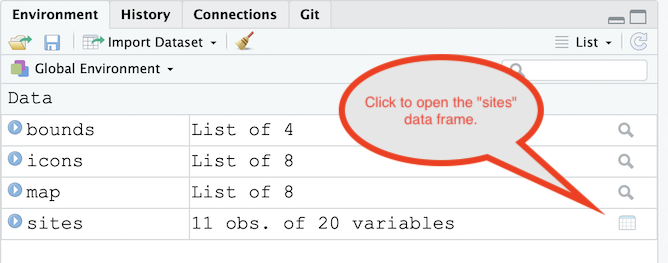
This reads the data contained in the file sites.csv into an R data frame, a spreadsheet-like data structure used extensively in R. The read.csv function returns a data frame assigned to the sites variable through use of the R assignment operator <-. Recall that we used sites.csv with Google Maps and QGIS to map the locations of our 11 study sites. But this time we are reading a copy of the file that resides on a web server, as indicated by the URL https://richardlent.github.io/rnotebooks/sites.csv. Click the Environment tab of RStudio, and you will see the sites data frame listed as having 11 observations and 20 variables. To open the data frame for viewing, click the data frame icon. . .
. . . and the data will open up in R’s data viewer:
(Click image to enlarge.)
This illustrates the versatility of the CSV data format. We have imported the same file into a data table in Google My Maps, into a QGIS attribute table, and now into an R data frame, and the data look exactly the same each time (which is a good thing).
Next, we bring in our state boundaries:
# State boundaries from the maps package. The fill option must be TRUE.
bounds <- map('state', c('Massachusetts', 'Vermont', 'New Hampshire'), fill=TRUE)
The R maps package lets us access boundary polygons of Massachusetts, Vermont, and New Hampshire from inside of R, instead of having to import the KML file vtnhma.kml as we did with Google Maps and QGIS. Three parameters are passed to the map function. The first, state, specifies that we want U. S. state boundaries. The second parameter lists the three states that we want, using the c function, which assembles or “collects” (hence the c) lists of things. The final parameter, fill=TRUE, is required so that the state boundaries are drawn correctly. (There are two Boolean values in R, TRUE and FALSE, that can function like switches to turn things on and off.)
We will later use the bounds variable, which contains the boundaries, as a layer in our Leaflet map.
The next block of R code creates a custom icon for mapping our site locations, and stores it in the variable icons:
# A custom icon.
icons <- awesomeIcons(
    icon = 'disc',
    iconColor = 'black',
    library = 'ion', # Options are 'glyphicon', 'fa', 'ion'.
    markerColor = 'blue',
    squareMarker = FALSE
)
The awesomeIcons function is part of the leaflet package and uses icons from the Font Awesome icon library. A series of parameters is passed to the awesomeIcons function to specify how we want the icon to look. We will use the custom icons variable shortly when we create the Leaflet map.
The next, larger block of code creates the Leaflet map and stores it in the variable map:
map <- leaflet(data = sites) %>%
    addTiles(group = "OpenStreetMap") %>% # Adds default OpenStreetMap base map.
    addProviderTiles("CartoDB.Positron", group = "Grey Scale") %>%
    addProviderTiles("Esri.WorldImagery", group = "Satellite") %>%
    addProviderTiles("Esri.WorldShadedRelief", group = "Relief") %>%
    addProviderTiles("Stamen.Watercolor", group = "Other") %>%
    addMarkers(~lon_dd, ~lat_dd, label = ~locality,
             popup = "<img src='https://richardlent.github.io/img/willie.png' height='149' width='112'>",
             group = "Sites") %>%
    # addAwesomeMarkers(~lon_dd, ~lat_dd, label = ~locality,
    #          popup = "<a href='https://www.rstudio.com/'>RStudio</a>",
    #          group = "Sites", icon=icons) %>%
    addPolygons(data=bounds, group="States", weight=3.5, fillOpacity = 0) %>%
    addLayersControl(
        baseGroups = c("OpenStreetMap", "Grey Scale", "Satellite", "Relief", "Other"),
        overlayGroups = c("Sites", "States"),
        options = layersControlOptions(collapsed = FALSE)
    )
The first thing that we should note about this block of R code is the odd-looking %>% symbol. This is the pipe operator, part of the magrittr package (which is automatically imported by the leaflet package). It allows you to figuratively create “pipes” in your code, whereby the results of function calls are fed, or piped, into the input of other calls.
So in the above code block, we create a Leaflet map in the variable map by piping the results returned by a whole series of function calls back up into the map variable. The cumulative effect of this piping activity is to say “Create a Leaflet map, then add some base maps, then some markers, then some state boundaries, then a layers control.” The pipe operator allows us to write R code that is more streamlined and easier to read, in a manner of speaking.
There are two Leaflet functions that let us add base maps from tile servers, as we did in QGIS. The addTiles function adds the standard OpenStreetMap layer. The other function, addProviderTiles, adds basemaps other than the standard OpenStreetMap layer. Thus the following lines:
addTiles(group = "OpenStreetMap") %>% # Adds default OpenStreetMap base map.
addProviderTiles("CartoDB.Positron", group = "Grey Scale") %>%
addProviderTiles("Esri.WorldImagery", group = "Satellite") %>%
addProviderTiles("Esri.WorldShadedRelief", group = "Relief") %>%
addProviderTiles("Stamen.Watercolor", group = "Other") %>%
add a total of five base map layers to our Leaflet map. The layers can be turned on and off by the user through use of the layers control added by the addLayersControl function. In each of these function calls we specify a group parameter, which is the name we want to give to the layer in the layer control. The first parameter of the addProviderTiles function is the name of the base layer, obtained from a much larger list of available base maps. (The addTiles function only provides the OpenStreetMap base map, so we don’t need to specify one.)
Next, we add our site locations:
addMarkers(~lon_dd, ~lat_dd, label = ~locality,
   popup = "<img src='https://richardlent.github.io/img/willie.png'
   height='149' width='112'>", group = "Sites") %>%
The call to the addMarkers function depends on our previous call to the leaflet function:
map <- leaflet(data = sites) %>%in which we specify that we want to use the sites data frame as a data source for the map (data = sites). This lets us specify the variables lon_dd, lat_dd, and locality by prefacing each with the tilde symbol (~). Thus the first two parameters passed to addMarkers specify which variables we want to use as the latitude and longitude of each marker. As with our previous web mapping examples, the coordinates must be in decimal degrees.
The next two parameters, label and popup, specify what happens when we hover and click each marker using a mouse cursor. The label = ~locality parameter specifies that we want to use the name of each site, which is stored in the locality variable, to display when we hover our mouse cursor over the marker. The popup parameter specifies a chunk of HTML code that will be run when the user clicks the marker (instead of just hovering and not clicking). In this example I have written an HTML image tag that shows a picture of my cat Willie (may he rest in peace). Finally, the group = "Sites" parameter provides a name for the marker layer to use in the layers control.
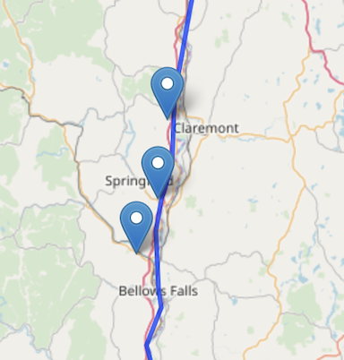
The addMarkers function adds generic markers to the Leaflet map, that look like this:
As mentioned previously, we can also add custom markers, that look like this, with a custom icon and color:
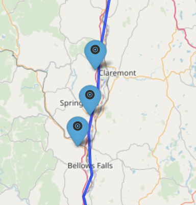
The following block of code does just that, using the Leaflet function addAwesomeMarkers:
# addAwesomeMarkers(~lon_dd, ~lat_dd, label = ~locality,
#    popup = "<a href='https://www.rstudio.com/'>RStudio</a>",
#    group = "Sites", icon=icons) %>%
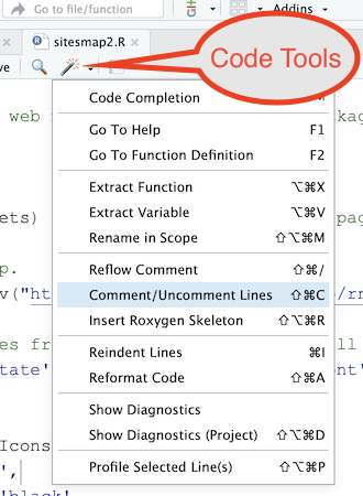
Notice that the above code has comment symbols at the start of each line. This block of code is “commented out,” which means that we have made each line of code into a comment to turn it off. This happens because comment lines are ignored by the R interpreter, and is another handy use of the # symbol in R. You can use the Code Tools icon (the magic wand) in the RStudio text editor to facilitate turning code off and on using comments:
The last parameter of the addAwesomeMarkers function call, icon=icons, uses the icons variable that we created previously with the awesomeIcons function. So if instead of the standard Leaflet markers, you want to use custom markers, then comment out the addMarkers function call and un-comment the addAwesomeMarkers call. Save your changes in the sitesmap2.R file and re-source the code.
The next line of code adds our state boundaries as a polygon layer:
addPolygons(data=bounds, group="States", weight=3.5, fillOpacity = 0) %>%Here we pass in the bounds variable that we created previously with the map function. We give the layer the name “States” that will appear in the layers control, give the polygon features a weight of 3.5 (which makes the lines thicker), and use fillOpacity = 0 so that we get just the boundary lines without filling the state polygons with a color.
Finally, we add the layers control to the Leaflet map:
addLayersControl(
   baseGroups = c("OpenStreetMap", "Grey Scale", "Satellite", "Relief", "Other"),
   overlayGroups = c("Sites", "States"),
   options = layersControlOptions(collapsed = FALSE)
)
In the baseGroups parameter to the addLayersControl of the leaflet package, we list the group names that we have previously assigned to each of the five base map layers. The overlayGroups parameter lists the names that we gave to our site point layer and the state boundaries, both of which are layers that are overlain onto the base map layers. The final parameter, options = layersControlOptions(collapsed = FALSE), makes it such that all of the layers in the layers control are visible, versus being collapsed into an icon that has to be clicked to see the layers.
We finally come to the final two lines of code:
print(map)
saveWidget(map, file="sitesmap2.html", selfcontained=TRUE)
The statement print(map) displays the finished Leaflet map to RStudio’s Viewer panel. Without this line, the map would be created in the variable map, but nothing would appear in the Viewer panel, unless you manually typed print(map) into the R console.
The last line of code calls the saveWidget function of the htmlwidgets package to create the file sitesmap2.html (or whatever file name you specify), which is a web page containing the Leaflet map. The first parameter passed to the saveWidget function is the name of the variable, map, in which we have created the Leaflet map. The second parameter is the name of HTML file we wish to create. The third parameter, selfcontained=TRUE, specifies that we want all HTML code, JavaScript code, and other resources to be encoded and packaged into one file, in this case sitesmap1.html. This streamlines the process of publishing the Leaflet map, because we then only have one file to upload.
Speaking of publishing: It’s easy, and free, to publish your R Leaflet web maps on RPubs, a web hosting platform provided by RStudio. You first need to sign up for a free account on RPubs.com:
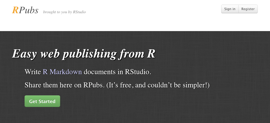
Click the Register button, fill out the brief form, including a user name and password, click Register Now, and you’re set to go.
Then, in RStudio, source the sitesmap2.R file to display the map in the RStudio Viewer pane. In the Viewer pane, click the Publish button:
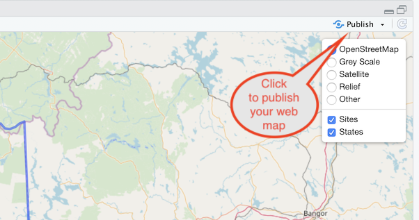
In the box that appears, select to publish the map to RPubs:
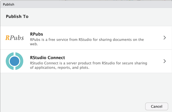
Click the Publish button in the next box that appears, and you will then be brought to the sign-in screen of RPubs. Sign in with the login credentials that you created previously.
Fill in the details of your map:
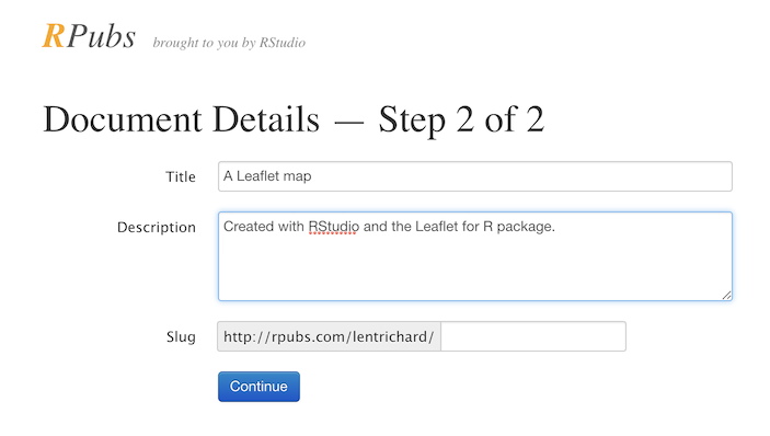
Then click Continue, and your map is published! You can link to the map using the URL that is displayed in the web browser.
To see a finished version of this map running on RPubs, click here.
Some additional Leaflet-for-R links:
Is Leaflet a better tool than Google Maps? [Verdict: “Need directions? Use Google Maps. Need to develop an application? Use Leaflet.”]
Google Maps API or Leaflet: What’s Best for your Project?
See Making Maps with R for more map coding examples that show different approaches to making maps with R.
More examples of Leaflet maps created in RStudio:
- London Income Map
- geoExploreR
- Mapping Toronto
- New Zealand Institute for Pacific Research
- Population of Ukraine
- Four-Year Not-for-Profit Colleges
- Nepal Earthquakes
Go here for even more examples.
In conclusion
The field of web mapping is developing rapidly, and there are many more technology options for the end user to consider than existed even a few years ago. This post has focused in some detail on three different approaches to creating interactive web maps, ranging from drag-and-drop mapping environments that do not require coding (Google My Maps), to mapping applications that write the code for you (QGIS + qgis2web), to those where you need to have some coding skills (Leaflet for R.) None of the three systems presented here require spending any money to produce a web map. The only cost incurred might be for web server space, but there are free alternatives for that too, e.g., GitHub Pages and RPubs. (Web maps produced from the examples in this post are currently living on GitHub [here] and RPubs [here].)
With any web mapping system there are tradeoffs between ease of use, functionality, and cost. There is a growing list of web-based mapping platforms, many of which profess easy-to-use, drag-and-drop environments for mapping your data. Free systems may indeed be easy to use but usually limit how much data can be mapped, how many base map and data layers can be included, and other aspects of map design and styling. You often have to pay subscription fees in order to get more mapping power. However, for those who are pressed for time and with adequate funds, commercial web mapping platforms may be a viable solution.
At the other end of the spectrum, investing some time in learning a little bit of R programming lets you create cost-free, powerful web maps that are not limited by vendor restrictions. And here we have only scratched the surface of the types of interactive web applications that can be created with R, RStudio, and Shiny (a web framework for R). To get an idea of what can be done with a little R coding (OK, so maybe more than a little), go here. And here.
To “serve” a web map means to put it on a web server, so that it is accessible to the internet.↩
“Nothing in the world is worth having or worth doing unless it means effort, pain, difficulty.” - Theodore Roosevelt↩
Google Maps now charges fees for use of its base layers in mapping applications, whereas OpenStreetMap is completely free.↩
It’s actually https://www.google.com/maps/, but same difference.↩

