Reading time: 32 minute(s) @ 200 WPM.
Preliminaries
At some time or another, most users of statistics find themselves sitting in front of a large pile of computer output with the realization that it tells them nothing that they really want to know. — Multivariate Statistical Methods: A Primer, fourth edition (2017)
Multivariate analysis is that branch of statistics concerned with examination of several variables simultaneously. One of the best introductory books on this topic is Multivariate Statistical Methods: A Primer, by Bryan Manly and Jorge A. Navarro Alberto, cited above. In particular, the fourth edition of the text introduces R code for performing all of the analyses, making it an even more excellent reference than the previous three editions.
This post assumes that the reader has a basic familiarity with the R language. R is a free, open-source, cross-platform programming language and computing environment for statistical and graphical analysis that can be obtained from www.r-project.org. To get started with R, see An Introduction to R. R can be run either by itself, as a standalone application, or inside of RStudio, a free, cross-platform integrated development environment. For more information on RStudio, see RStudio as a Research and Writing Platform.
The examples in this post demonstrate several multivariate techniques applied to two biological datasets. Examples will be presented as R code to be executed in the console (a command-line interface) of the standalone R application, but they can also be run in the R console pane inside of RStudio. The examples are cumulative, so that later examples assume the presence of data structures created earlier.
An excellent general R reference is Quick-R, and the R Reference Card is a handy list of the most useful R commands.
Multivariate data
Let’s get some multivariate data into R and look at it. The comma-separated values file sites.csv.txt contains ecological data for 11 grassland sites in Massachusetts, New Hampshire, and Vermont. The metadata file describing the data is sites.metadata.txt.
We can read this data file into an R data frame with the following command:
sites <- read.table("https://richardlent.github.io/datasets/sites.csv.txt", sep=",", header=TRUE)
After issuing this command, type attach(sites) so that we can refer to the variables directly by name instead of having to also reference the data frame, as in sites$locality.
If you then type the data frame name sites at the R console, you should see something like this:
         locality code grass moss sedge forb fern bare woody shrub lon_utm lat_utm    lon_dd   lat_dd fwlength thorax spotting rfray rhray  n
1   Bellows Falls   BF    46  3.5     0   34  0.5  4.0  10.0     0  703877 4784632 -72.49113 43.18695     15.8    3.6      1.6   1.6   1.4 62
2     Springfield   SP    49  0.0     0   24  1.0  0.5  14.4     0  707151 4793906 -72.44740 43.26949     16.0    3.7      1.1   2.0   1.5 51
3  Mount Ascutney   MA    49  0.0     4   17  5.0  0.0   0.0     0  708310 4806931 -72.42819 43.38634     16.2    3.8      1.2   1.9   1.6 58
4     Bernardston   BE    49  1.0     0   29  0.0  0.0  11.0     7  696647 4725212 -72.60087 42.65425     16.7    3.7      1.4   1.8   1.6 27
5            Lyme   LY    50  0.0     0   14  4.0  0.0   0.0     0  729474 4856926 -72.14600 43.82977     15.6    3.6      1.1   1.8   1.3 52
6         Fairlee   FA    50  5.0     0   12  0.0  2.0   0.0     0  729045 4868779 -72.14624 43.93649     15.9    3.8      1.0   1.8   1.5 25
7         Newport   NW    49  0.0     0   35  0.0  0.0   0.0     0  724169 4977885 -72.15977 44.91907     16.7    3.7      1.1   1.8   1.3 21
8         Orleans   OR    49  0.0     0   41  0.0  0.0  19.0     0  723193 4960641 -72.17970 44.76433     16.1    3.8      1.4   1.9   1.7 41
9     Lyndonville   LN    50  0.0     0    9  0.0  0.0   3.0     0  734359 4935471 -72.05029 44.53447     16.0    3.7      1.4   1.9   1.7 52
10  St. Johnsbury   SJ    49  0.0     0   42  0.0  0.0   0.0     0  734215 4925655 -72.05655 44.44626     15.7    3.6      1.2   1.9   1.7 56
11        Hanover   HA    49  0.0     0   38  5.0  0.0   5.0     0  715984 4843575 -72.31896 43.71376     16.0    3.6      1.2   1.8   1.8 65
The column headings are the variable names, with the rows corresponding to 11 grassland sites located along a south-north transect running through Massachusetts, New Hampshire, and Vermont. Site names are in variable locality, with two-letter site abbreviations in code. For each site, multiple variables have been measured. (Hence the name, multivariate: multi = multiple, variate = variable. Get it?) At each site, vegetation variables were measured along a 50-meter transect. For each of the 8 vegetation variables (grass through shrub), values represent the percentage of 50 transect points at which each type of vegetation was present. The spatial coordinates of each site are in variables lon_utm (longitude, UTM coordinates in meters), lat_utm (latitude, UTM), lon_dd (longitude, decimal degrees), and lat_dd (latitude, decimal degrees). Additional variables represent means of morphological measurements of male Common Ringlet (Coenonympha tullia) butterflies inhabiting each site. Morphological variables are length of right forewing (fwlength, mm), length of thorax (thorax, mm), number of eyespots or ocelli (spotting, count), length of right forewing ray (rfray, ordinal 0 through 3), and length of right hindwing ray (rhray, ordinal 0 through 3). The final variable, n, is the number of male Ringlets measured at each site.
The study that produced this dataset is described in greater detail in Habitat structure and phenotypic variation in the invading butterfly Coenonympha tullia, an R Notebook that contains embedded R code for production of statistical analyses and graphics. The process of producing the R Notebook is described in RStudio as a Research and Writing Platform.
A map
Let’s first make a map of the study sites, the coding of which will serve as a bit of an R refresher. You can copy-paste the following R code directly into the R console.
library(maps)     # Draw geographical maps.
library(mapdata)  # Map databases.

sites <- read.table("https://richardlent.github.io/datasets/sites.csv.txt", sep=",", header=TRUE)

map('state', c('Vermont','New Hampshire','Massachusetts'),
    xlim=c(-74, -69), ylim=c(41, 45.5),
    col='gray90', fill=TRUE, mar=c(0, 0, 1, 0))
with(sites, points(lon_dd, lat_dd, pch=16, col='black', cex=.7))
with(sites, text(lon_dd-.15, lat_dd, cex=0.8, labels=code))
text(-72, 42.4, labels='MA', cex=1.5)
text(-71.5, 43.4, labels='NH', cex=1.5)
text(-72.9, 44.3, labels='VT', cex=1.5)
box()
map.scale(ratio=FALSE, metric=FALSE)
When you hit the Enter key at the end of the last line of R code, you should get a map that looks something like this:
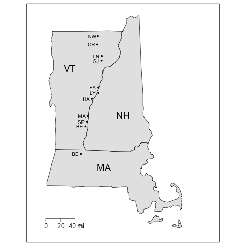
The code first loads two R packages. (You will have to install the packages before you can load them with the library() function.) The maps package contains functions for drawing geographical maps, and the mapdata package is a database containing map boundary files. A data frame called sites is then created using the URL that points to the CSV data file residing on a server. (Yes, we already created the sites data frame above in a previous example, but it won’t matter if it’s created again.) The map() function is then called with arguments that extract the boundaries of the three states, set geographic limits of the map, choose a fill color, and adjust the margins so the map fits better on the page. Next, the points() function (part of the base graphics package) is used to plot the site locations using decimal degree coordinates. Labels for the sites (using the two-letter abbreviations in the code variable) and for the states are plotted using the text function to locate text using the latitude-longitude coordinates of the map. The calls to both the points() and text() functions are contained in calls to the with function, allowing us to apply those functions specifically to the sites dataset so that we can use the variable names in sites directly without the need for syntax like sites$lon_dd. We then draw a box around the map using the box function and add a scale with the map.scale function. All of this works because the base graphics package in R will keep drawing a sequence of graphic statements to the same graphics window until the window is closed or a new graphics window is created.
To see how to produce prettier, interactive maps with this and other datasets, see the R Notebook Making Maps with R.
Distance matrices
The map of our study sites gets us thinking about distances, both geographical distances and ecological distances. To express geographical and ecological distance we will construct several distance matrices. A distance matrix expresses the dissimilarities between all pairs of objects (in this case, our 11 study sites) by computing a distance measure based on several variables. A common distance measure is Euclidean distance, the simple “as the crow flies” distance between two points in a plane or Cartesian coordinate system. Euclidean distance can be extended to an n-dimensional space in which each of the n dimensions is a variable used to compute the distance measure. The greater the distance between two objects in the multidimensional space, the less similar they are. There are numerous measures of ecological dissimilarity, and of course, there is an R package to compute them (see Dissimilarity Indices for Community Ecologists).
In R, the following statement:
sites.veg <- dist(cbind(moss, sedge, forb, fern, bare, woody, shrub), method="euclidean")
computes Euclidean distances between all pairs of sites based on the vegetation variables and stores the distances in the lower-diagonal matrix sites.veg. The cbind function packages or binds several vectors into a matrix, which we can then hand off to the dist function. [Euclidean is the default distance metric, so we don’t actually have to specify it.] Note that we are not using the grass variable as it does not vary much among sites, which you can see by typing the variable name grass to display the vector of grass values. Typing sites.veg displays the lower-diagonal matrix; to display the entire, symmetrical matrix type as.matrix(sites.veg) . Go here for more examples of R data type conversions.
Here is the full vegetation distance matrix, with the rows and columns labeled with site names:
               Bellows Falls Springfield Mount Ascutney Bernardston      Lyme   Fairlee   Newport  Orleans Lyndonville St. Johnsbury   Hanover
Bellows Falls       0.000000   12.004582      21.295539    9.874209 23.248656 24.300206 11.379807 12.58968   26.504717     13.874437  9.460444
Springfield        12.004582    0.000000      16.988526    9.370699 17.793538 19.483583 18.155165 17.64681   18.873526     23.078345 17.338108
Mount Ascutney     21.295539   16.988526       0.000000   18.867962  5.099020  9.746794 19.104973 31.27299   10.677078     25.806976 21.954498
Bernardston         9.874209    9.370699      18.867962    0.000000 20.297783 21.886069 14.387495 16.06238   22.671568     18.439089 13.856406
Lyme               23.248656   17.793538       5.099020   20.297783  0.000000  7.000000 21.377558 33.25658    7.071068     28.284271 24.535688
Fairlee            24.300206   19.483583       9.746794   21.886069  7.000000  0.000000 23.622024 35.08561    6.855655     30.479501 27.477263
Newport            11.379807   18.155165      19.104973   14.387495 21.377558 23.622024  0.000000 19.92486   26.172505      7.000000  7.681146
Orleans            12.589678   17.646813      31.272992   16.062378 33.256578 35.085610 19.924859  0.00000   35.777088     19.026298 15.165751
Lyndonville        26.504717   18.873526      10.677078   22.671568  7.071068  6.855655 26.172505 35.77709    0.000000     33.136083 29.495762
St. Johnsbury      13.874437   23.078345      25.806976   18.439089 28.284271 30.479501  7.000000 19.02630   33.136083      0.000000  8.124038
Hanover             9.460444   17.338108      21.954498   13.856406 24.535688 27.477263  7.681146 15.16575   29.495762      8.124038  0.000000
To produce this matrix with nice row and column labels, we had to go through a few R machinations, because a dist matrix by default is only labeled with row and column numbers. To label the rows and columns with something intelligible, we have to first convert the dist matrix to a regular R matrix, and then use the dimnames function to label the rows and columns with site names (the locality variable). This is necessary because the dimnames function doesn’t work with distance matrices. And so:
sites <- read.table("https://richardlent.github.io/datasets/sites.csv.txt", sep=",", header=TRUE)
attach(sites)
sites.veg <- dist(cbind(moss, sedge, forb, fern, bare, woody, shrub), method="euclidean")
sites.veg.matrix <- as.matrix(sites.veg)
dimnames(sites.veg.matrix) <- list(locality, locality)
sites.veg.matrix # Displays the labeled matrix.
See Dimnames of an Object for more information on how to use the dimnames() function.
Pairs of sites that have similar values of all vegetation variables have smaller values of Euclidean distance, and are thus more similar to each other in a multivariate sense, as if the sites were plotted in an n-dimensional space1 where n is the number of variables. This is a type of ecological distance, which is often computed using species abundances measured on each site, but which can use other types of variables such as vegetational composition or soil types.2 Euclidean distance ranges from zero for identical sites (i.e., along the diagonal, the distance of each site to itself) to an arbitrary upper bound.
We will compute two additional Euclidean distance matrices. One is based on the butterfly variables, which are a multivariate measure of the average male phenotype at each site:
sites.pheno <- dist(cbind(fwlength, thorax, spotting, rfray, rhray), method="euclidean")
The third distance matrix is based on the latitude and longitude of each site:
sites.geo <- dist(cbind(lat_utm, lon_utm), method="euclidean")
When Euclidean distance is calculated using spatial coordinates it yields a measure of the geographic distance between sites. Here we are using the UTM coordinates so that our inter-site distances are in meters.
Here is the matrix of geographic distances between sites in meters:
               Bellows Falls Springfield Mount Ascutney Bernardston      Lyme   Fairlee   Newport   Orleans Lyndonville St. Johnsbury   Hanover
Bellows Falls          0.000    9834.945       22735.37    59858.24  76691.78  87830.21 194315.43 177065.74  153888.129    144249.370  60173.55
Springfield         9834.945       0.000       13076.46    69492.44  66856.84  78008.42 184764.40 167504.94  144155.903    134500.034  50448.30
Mount Ascutney     22735.367   13076.464           0.00    82547.08  54290.10  65231.25 171688.03 154428.84  131152.896    121517.312  37438.92
Bernardston        59858.243   69492.443       82547.08        0.00 135743.10 147177.15 254167.48 236920.88  213614.236    203933.202 119932.14
Lyme               76691.778   66856.838       54290.10   135743.10      0.00  11860.76 121075.28 103905.02   78696.761     68892.326  18979.71
Fairlee            87830.210   78008.419       65231.25   147177.15  11860.76      0.00 109214.90  92048.21   66903.374     57110.492  28387.17
Newport           194315.432  184764.403      171688.03   254167.48 121075.28 109214.90      0.00  17271.60   43620.907     53187.358 134559.17
Orleans           177065.739  167504.943      154428.84   236920.88 103905.02  92048.21  17271.60      0.00   27535.585     36681.122 117287.76
Lyndonville       153888.129  144155.903      131152.90   213614.24  78696.76  66903.37  43620.91  27535.59       0.000      9817.056  93715.08
St. Johnsbury     144249.370  134500.034      121517.31   203933.20  68892.33  57110.49  53187.36  36681.12    9817.056         0.000  84080.29
Hanover            60173.555   50448.305       37438.92   119932.14  18979.71  28387.17 134559.17 117287.76   93715.076     84080.294      0.00
It would be reassuring if our computed inter-site distances were more or less “correct.”
And thus the computed distance between Orleans, Vermont and Bernardston, Massachusetts is 236920.88 meters. There are 1609.34 meters in a mile, yielding 147 miles between the two towns. Firing up Google Maps, we get a distance of 167 miles between the two towns, a 20-mile discrepancy. (Not that bad. I’ve seen worse.)
Let’s try two more towns. Our computed distance between Fairlee, Vermont and Lyme, New Hampshire is 11860.76 meters, or 7 miles. Google Maps gives us 8 miles.
This, as they say, is close enough for government work. Google Maps uses the center of a town for the town’s location, whereas our study sites are located varying distances from town centers. That alone will introduce error in the comparison. Also, Google Maps uses decimal degree coordinates, whereas our distance matrix was computed using UTM coordinates. This may introduce some additional slop. In addition, the boundary between UTM Zones 18 and 19 passes right through the center of the three-state area, introducing more error. But in this exercise we just need a measure of the relative distances between towns, so our matrix of Euclidean geographic distances should suffice.
Cluster analysis
One way to visualize multivariate distances is through cluster analysis, a technique for finding groups in data. Cluster analysis produces a tree diagram, or dendrogram, showing the distance relationships among a set of objects, which are placed into groups (clusters). As described by Manly and Alberto, page 163:
Suppose that there is a sample of n objects, each of which has a score on p variables. Then, the idea of a cluster analysis is to use the values of the variables to devise a scheme for grouping the objects into classes so that similar objects are in the same class. The method used must be completely numerical, and the number of classes is not usually known.
Using our vegetation distance matrix, we can produce a hierarchical cluster analysis with the following R command:
veg.clust <- hclust(sites.veg, method="average")
and we can view the dendrogram by typing plot(veg.clust).
By default, the dendrogram uses row numbers as branch labels. Let’s add a custom title and branch labeling and remove the annoying subtitle at the bottom of the plot. We will also add labels for three clusters, to be discussed shortly.
plot(veg.clust, labels=code, main="Figure 1. Clustering of Sites by Vegetation Structure", xlab="", ylab="Euclidean Distance", sub="")
text(10.1, 16, labels='1', cex=2)
text(2, 11, labels='2', cex=2)
text(6.5, 11, labels='3', cex=2)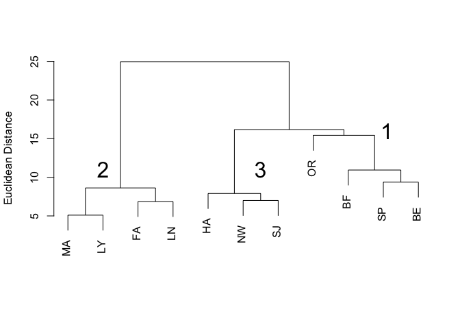
In the dendrogram (Figure 1), individual branches represent the 11 sites and are labelled with the site abbreviations contained in the code variable. Three distinct clusters are apparent, which I have labelled 1, 2, and 3.
The objective of cluster analysis is to group a set of objects such that objects in the same cluster are more similar to each other than they are to objects in other clusters. There are many clustering algorithms; the one performed in this example by the hclust function is called agglomerative hierarchical clustering. Starting with a matrix of distances between objects, all objects begin by themselves in clusters of size one. The algorithm then merges objects into clusters, beginning with the two closest objects. In our vegetation distance matrix, the two closest objects (sites) are Mount Ascutney and Lyme, with a Euclidean distance of 5.099020, and they are joined into a cluster at the lowest (closest) level in the dendrogram (Figure 1). The next closest pair of sites is Fairlee and Lyndonville, with a Euclidean distance of 6.855655. Those two sites are joined together because they are closer to each other than they are to the first cluster consisting of Mount Ascutney and Lyme. The agglomerative process proceeds through the remaining sites, using the values in the distance matrix to either join sites into new clusters or to add sites and other clusters to existing clusters, depending on the Euclidean distance separating them. At each step, the two clusters separated by the shortest distance are combined. When a cluster is formed, the average pairwise distance between members of that cluster is used to determine whether a new site should be added to that cluster or be joined into a new cluster. This is called average linkage and was chosen in the method="average" argument to the hclust() function. The clustering algorithm continually updates the distance matrix, removing rows and columns as sites and clusters are merged into larger clusters. The algorithm terminates when all sites are contained in one cluster, at the top level of the dendrogram.
Next let’s cluster the sites by butterfly phenotype:
pheno.clust <- hclust(sites.pheno, method="average")
plot(pheno.clust, labels=code, xlab="", ylab="Euclidean Distance", main="Figure 2. Clustering of sites by butterfly phenotype", sub="")
text(10.7, 0.65, labels='1', cex=2)
text(6.3, 0.5, labels='2', cex=2)
text(2, 0.5, labels='3', cex=2)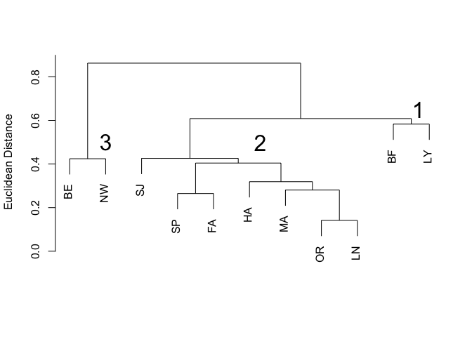
Again we have three distinct clusters (Figure 2), labelled as before.
We can compare clusters in terms of the original variables that produced the distance matrices. A simple way to compare clusters in a dendrogram is to create a grouping variable that indicates the cluster membership of each object, and then compare variables by cluster membership. The cutree function creates a vector of cluster memberships at a particular height in the dendrogram . We can then merge this cluster membership vector back into the original data, create a character vector of the habitat variables we want to summarize, and then use the aggregate function to compute means of the habitat variables by cluster.
Here is the R code, which will reproduce Table 1, below:
cluster <- cutree(veg.clust, h=16)
vars <- c('moss','sedge','forb','fern','bare','woody','shrub')
veg.groups <- cbind(cluster,sites[vars])
table1 <- aggregate(veg.groups[vars], list(veg.groups$cluster), mean)
colnames(table1)[1] <- 'Cluster'
print(signif(table1, 2), row.names=FALSE)
The cutree() function cuts the vegetation structure tree at a Euclidean distance of 16 (chosen by eyeballing the dendrogram to see where we could cut off our three clusters). We then create a vector vars containing the list of variables for which we want to compute means by cluster, and then create a new data frame, veg.groups, containing the original vegetation variables plus the vector of cluster memberships. The aggregate function then is used to create another data frame containing variable means for the three clusters; this is shown in Table 1.
Table 1. Means of site habitat variables by cluster; see Figure 1.
 Cluster moss sedge forb fern bare woody shrub
       1  1.1     0   32 0.38  1.1 14.00   1.8
       2  1.2     1   13 2.20  0.5  0.75   0.0
       3  0.0     0   38 1.70  0.0  1.70   0.0
Cluster 1 (Orleans, Bellows Falls, Springfield, Bernardston; see Figure 1) contained sites that were shrubby and woody. Sites in cluster 2 (Mount Ascutney, Lyme, Fairlee, Lyndonville) had the lowest percentage occurrence of forbs. Moss, sedges, bare ground, and shrubs were absent at the sites in Cluster 3 (Hanover, Newport, St. Johnsbury). The habitat structure clustering was broadly related to geographic location of the sites (see the map of study sites). Cluster 1 sites were mostly southern, cluster 3 sites were mostly northern, and sites in cluster 2 were somewhat in the middle.
Here now is the R code for computing means of the butterfly phenotype variables according to cluster membership (see Figure 2). The results are in Table 2.
cluster <- cutree(pheno.clust, h=0.59)
vars <- c('fwlength','thorax','spotting','rfray','rhray')
pheno.groups <- cbind(cluster,sites[vars])
table2 <- aggregate(pheno.groups[vars], list(pheno.groups$cluster), mean)
colnames(table2)[1] <- 'Cluster'
print(signif(table2, 3), row.names=FALSE)
Table 2. Means of site phenotype variables by cluster; see Figure 2.
 Cluster fwlength thorax spotting rfray rhray
       1     15.7   3.60     1.35  1.70  1.35
       2     16.0   3.71     1.21  1.89  1.64
       3     16.7   3.70     1.25  1.80  1.45
Cluster 1 (Bellows Falls, Lyme) had the smallest butterflies in terms of forewing and thorax length, with more ocelli but shorter fore- and hindwing rays (Table 4). Ringlets in cluster 3 (Bernardston, Newport) had the largest forewings. Butterflies in cluster 2 (St. Johnsbury, Springfield, Fairlee, Hanover, Mount Ascutney, Orleans, Lyndonville) had an intermediate forewing length and the longest rays on both forewings and hindwings. Clusters 1 and 3 each contained only two sites and differed from each other mainly in Ringlet body size. In contrast, sites in the large cluster 2 had Ringlets with characters intermediate to those of clusters 1 and 3. Clusters 1 and 3 can be viewed as outlying clusters that differ from each other in addition to being different from the central cluster 2 containing the majority of sites. In contrast to the habitat clustering results, no strong relationship was apparent with regard to butterfly clusters and site location.
Mantel test
We can visually examine the structure of the dendrograms in Figures 1 and 2, along with the map of study sites, and wonder how they are related, if at all. However, because the dendrograms and the map are based on matrices of ecological and geographic distances, we can explicitly test the matrices for relationships between ecological distance and geographic distance using the Mantel test. The Mantel test is in R package ade4, which contains various exploratory and Euclidean methods for ecological data.
The Mantel test examines correlations between distance matrices. Matrix correlation can be quantified by computing the Pearson correlation coefficient between the elements of two distance matrices. But because of the statistical dependence among the cells of a distance matrix, ordinary tests of significance cannot be used. Instead, the Mantel test uses random permutations of the rows and columns of the distance matrices. This is done a large number of times (we will use 10,000 replications), and the correlation coefficient calculated each time, forming a sampling distribution. The observed matrix correlation is then compared with the sampling distribution to assess the significance of the observed correlation under the assumption of randomness.
We will test for matrix correlations between (1) vegetation and phenotype, (2) vegetation and geographic distance, and (3) phenotype and geographic distance. The questions addressed with these tests are:
Do sites that are similar in terms of their vegetation structure variables also tend to be similar in terms of butterfly phenotype variables?
Are sites that are closer together also similar in vegetation structure?
Are sites that are closer together also similar in butterfly phenotype?
The R code to produce the three Mantel tests is:
library(ade4) # You might have to install this package.
mt1 <- mantel.rtest(sites.pheno, sites.geo, nrepet=10000)
mt2 <- mantel.rtest(sites.veg, sites.geo, nrepet=10000)
mt3 <- mantel.rtest(sites.pheno, sites.veg, nrepet=10000)
The arguments to the mantel.rtest function are the two distance matrices we wish to test for correlation, followed by the number of random matrix permutations we wish to compute.
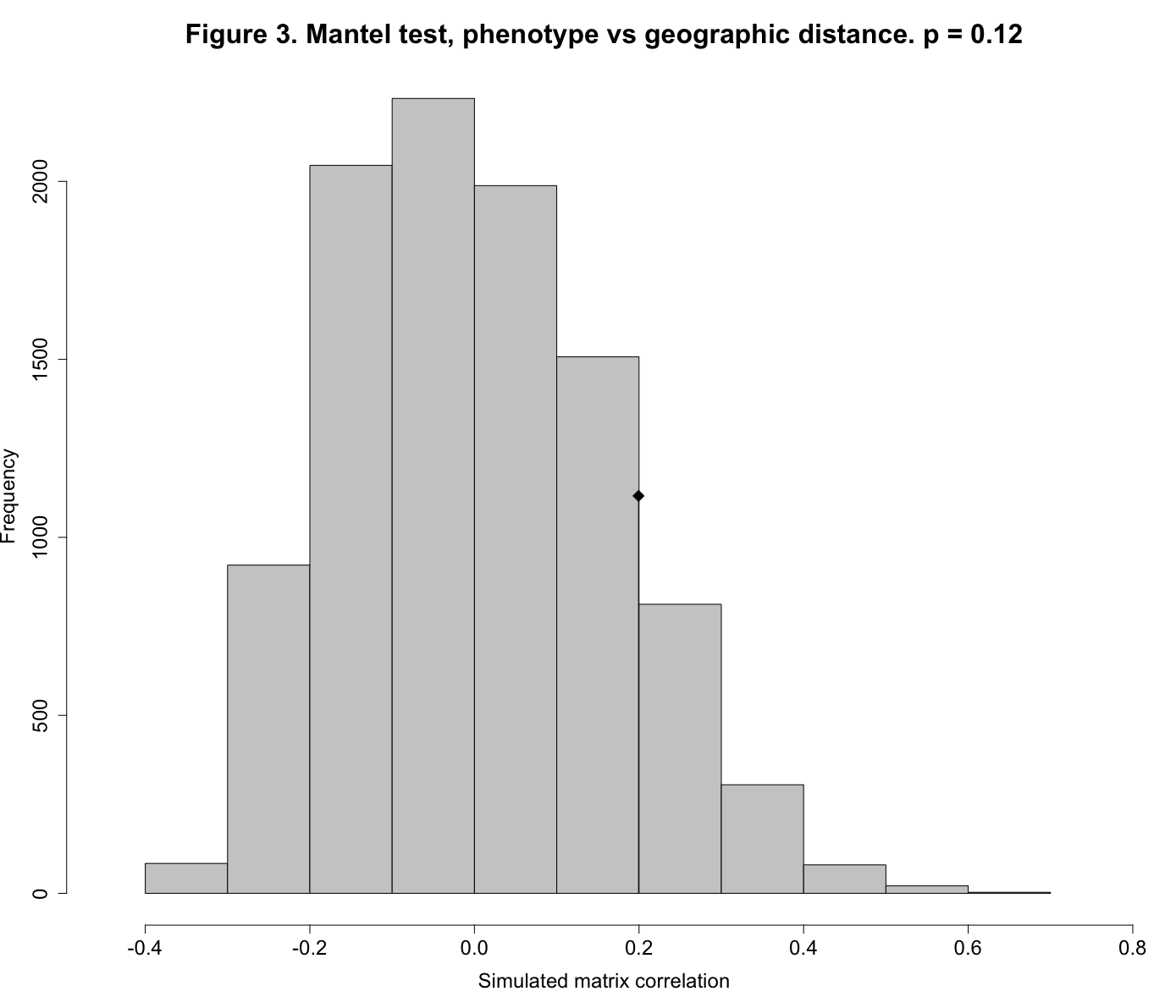
Sadly (at least for our careers), Mantel tests showed that the underlying matrix correlations were all nonsignificant. The observed matrix correlations of r = 0.199 for phenotype vs distance, r = -0.061 for habitat vs distance, and r = -0.25 for phenotype vs habitat are indistinguishable from randomly-generated values.
We will look in detail at just one of these tests, that of phenotype vs geographic distance.
Here again is the R statement to produce the Mantel test:
mt1 <- mantel.rtest(sites.pheno, sites.geo, nrepet=10000)
Results of the test are returned by the mantel.rtest function and stored in the object mt1. If you type the name mt1 at the R console, you will see the test results:
Monte-Carlo test
Call: mantel.rtest(m1 = sites.pheno, m2 = sites.geo, nrepet = 10000)

Observation: 0.1994129

Based on 10000 replicates
Simulated p-value: 0.1227877
Alternative hypothesis: greater

     Std.Obs  Expectation     Variance
1.2277313279 0.0004359013 0.0262663135
A Monte Carlo test uses repeated random sampling to obtain a result. As described by Manly:3 “With a Monte Carlo test the significance of an observed test statistic [here, the Pearson correlation between two distance matrices] is assessed by comparing it with a sample of test statistics obtained by generating random samples using some assumed model.” The value for Observation, 0.1994129, is the observed Pearson correlation between the elements of the phenotypic distance matrix and the matrix of between-site geographic distances. The simulated p-value of 0.1227877 indicates that our observed matrix correlation is indistinguishable from that produced by the random process of scrambling the rows and columns of the two matrices and then calculating the Pearson correlation between the two random matrices (which we did 10,000 times). Our observed matrix correlation could have just as easily been produced by chance. Figure 3 shows this graphically.
(Click on image to enlarge.)
You can reproduce Figure 3 simply by giving the mt1 object, containing the Mantel results, to the plot() function, with a few extra annotation arguments:
plot(mt1, main="Figure 3. Mantel test, phenotype vs geographic distance. p = 0.12", xlab="Simulated matrix correlation", cex.axis=1.5, cex.lab=1.5)
The cex arguments mean “character expansion” and control the size of text in the main title, axis scales, and axis labels.
The histogram shows the sampling distribution of our 10,000 randomly-produced Pearson correlations. The diamond symbol shows the location of our observed correlation (0.199), clearly indistinguishable from the random distribution.
Multidimensional scaling
A different approach to analysis of multivariate distances is multidimensional scaling (MDS). Whereas cluster analysis uses a distance matrix to group similar objects together, MDS transforms a distance matrix into a set of coordinates in two or three dimensions, thereby reducing the dimensionality (number of variables) of the data. The coordinates are chosen such that the distance between objects in the coordinate space matches the dissimilarities contained in the original distance matrix as closely as possible. This is accomplished through an interative procedure.
We will perform a nonmetric multidimensional scaling of the distance matrix computed from site vegetation data. This form of MDS uses only the rank order of Euclidean distances in the data matrix, not the actual dissimilarities. The algorithm finds a configuration of points whose distances reflect as closely as possible the rank order of the data. This helps us to deal with the fact that Euclidean distances are sensitive to data that are measured in different units.
We must first install and load the MASS package, which supports the textbook by Venables and Ripley, Modern Applied Statistics with S. (R is the open-source version of S.) Then, to perform the MDS, type:
mds <- isoMDS(sites.veg, k=2)
The parameter k in the isoMDS function is the number of dimensions desired, usually two or three. Then, type mds to display the coordinates:
$points
             [,1]       [,2]
 [1,]  -8.2570901  1.5705967
 [2,]   0.3704984  9.0606091
 [3,]  11.5322883 -3.5802348
 [4,]  -4.2901861  6.0242563
 [5,]  13.8881640 -2.4111070
 [6,]  16.2693211 -0.2900285
 [7,]  -6.5529737 -7.4143143
 [8,] -17.5046185  8.1669656
 [9,]  17.5635640  2.0934376
[10,] -12.2439032 -9.5377674
[11,] -10.7750640 -3.6824133

$stress
[1] 0.4373808
The value of stress is a measure of the degree of correspondence between the distance matrix and the set of coordinates produced by MDS. The iterative procedure inherent in nonmetric MDS seeks to minimize stress.
Because the notation for the column labels of the MDS coordinates is somewhat cumbersome, store them in a couple of vectors as follows:
mds1 <- mds$points[,1]
mds2 <- mds$points[,2]
Then, merge the coordinates with the original data with the following command:
sites.mds <- cbind(sites, mds1, mds2)
We can then plot our MDS configuration and label the points with our two-letter site codes as follows. We use the pos argument to the text function to place the labels above the plotted points.
plot(mds1, mds2, main="Figure 4. Multidimensional scaling plot, site vegetation data.", cex.axis=1.5, cex.lab=1.5)
text(mds1, mds2, labels=code, pos=3)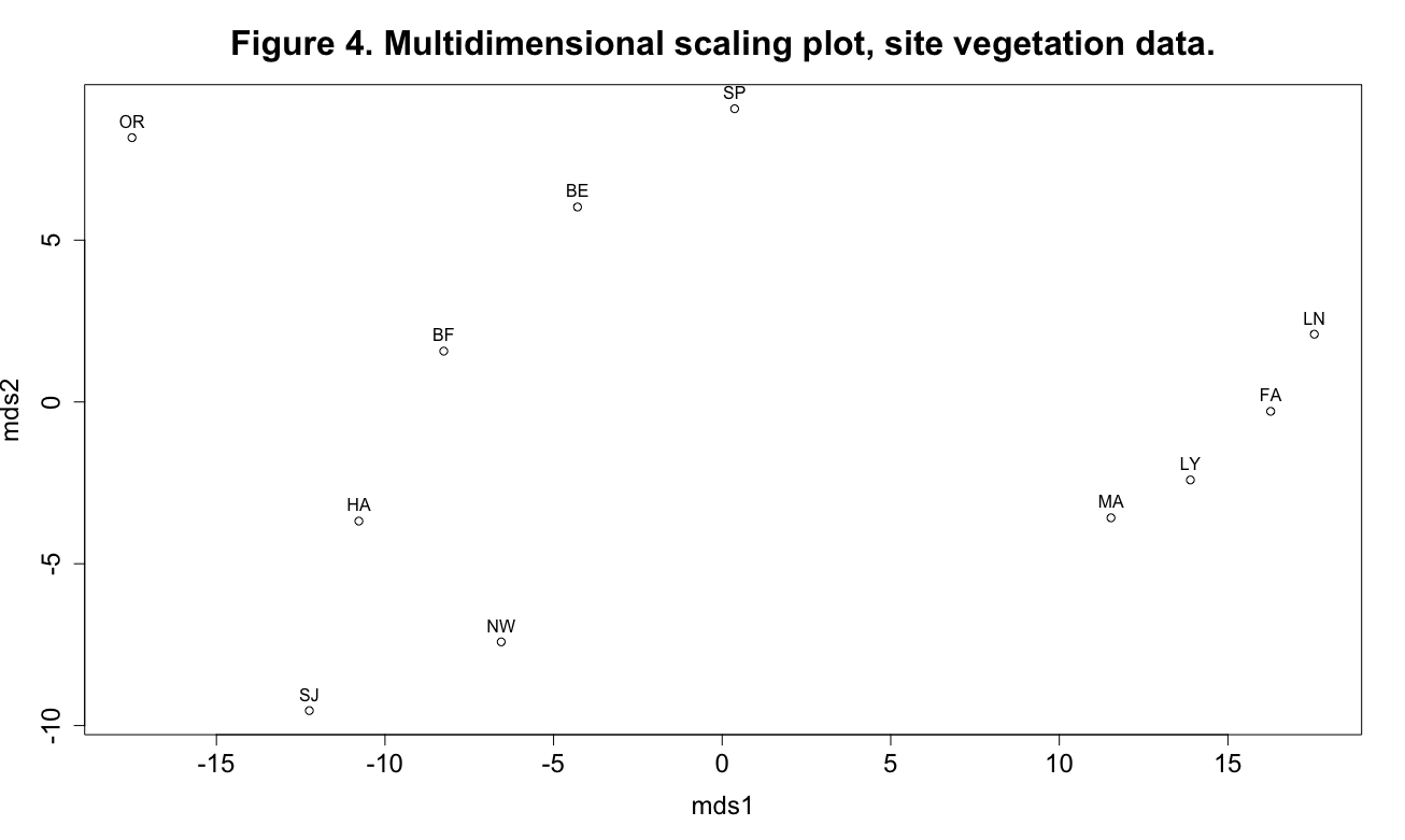
(Click image to enlarge.)
This plot shows some interesting patterning in the data, especially the four sites grouped at the extreme right end of the mds1 axis. The MDS axes can be viewed as synthetic variables: the analysis has reduced the dimensionality of the data from the original seven vegetation variables (remember that we’re not using the grass variable) to two synthetic axes.
One way to interpret the axes is to compute Pearson correlations between the axes and the original variables. For this, we load the Hmisc package and use the rcorr function:
library(Hmisc)
rcorr(cbind(mds1, mds2, moss, sedge, forb, fern, bare, woody, shrub), type="pearson")
Here is the output from rcorr, first the matrix of correlations, followed by the matrix of p-values:
       mds1  mds2  moss sedge  forb  fern  bare woody shrub
mds1   1.00 -0.02  0.22  0.30 -0.99  0.21  0.00 -0.53 -0.11
mds2  -0.02  1.00  0.10 -0.20 -0.13 -0.28  0.13  0.85  0.33
moss   0.22  0.10  1.00 -0.17 -0.22 -0.32  0.83 -0.07  0.03
sedge  0.30 -0.20 -0.17  1.00 -0.27  0.56 -0.15 -0.27 -0.10
forb  -0.99 -0.13 -0.22 -0.27  1.00 -0.17 -0.01  0.39  0.06
fern   0.21 -0.28 -0.32  0.56 -0.17  1.00 -0.24 -0.30 -0.22
bare   0.00  0.13  0.83 -0.15 -0.01 -0.24  1.00  0.12 -0.15
woody -0.53  0.85 -0.07 -0.27  0.39 -0.30  0.12  1.00  0.26
shrub -0.11  0.33  0.03 -0.10  0.06 -0.22 -0.15  0.26  1.00

n= 11

P
      mds1   mds2   moss   sedge  forb   fern   bare   woody  shrub
mds1         0.9513 0.5165 0.3663 0.0000 0.5431 0.9956 0.0946 0.7420
mds2  0.9513        0.7800 0.5652 0.6959 0.4069 0.7004 0.0008 0.3241
moss  0.5165 0.7800        0.6273 0.5130 0.3454 0.0016 0.8461 0.9393
sedge 0.3663 0.5652 0.6273        0.4271 0.0739 0.6534 0.4138 0.7699
forb  0.0000 0.6959 0.5130 0.4271        0.6211 0.9654 0.2334 0.8623
fern  0.5431 0.4069 0.3454 0.0739 0.6211        0.4697 0.3732 0.5170
bare  0.9956 0.7004 0.0016 0.6534 0.9654 0.4697        0.7304 0.6534
woody 0.0946 0.0008 0.8461 0.4138 0.2334 0.3732 0.7304        0.4439
shrub 0.7420 0.3241 0.9393 0.7699 0.8623 0.5170 0.6534 0.4439
We are mainly interested in the first two columns of each matrix, showing correlations and significance tests between the two MDS axes and the original vegetation variables used to produce the Euclidean distance matrix. Pearson correlations range between -1 and +1. A correlation of -1 means a perfect negative linear relationship between two variables, +1 means a perfect positive linear relationship, and a correlation of 0 indicates no linear relationship. In the matrix of p-values we look for the lowest values to help us find interesting relationships. Thus we see that as values of mds1 increase, values of forbs and woody vegetation decrease, whereas mds2 appears to be primarily an axis of increasing woody vegetation. (Of course with this type of shotgun approach we have to worry about spurious significances, but we’ll leave that for another day.)
Compare Figure 4 with Figure 1 and Table 1, because they represent different ways of looking at the same data. Cluster analysis is a type of classification technique, in which the objective is to arrange objects into groups. MDS is a form of ordination, in which objects are arranged along continuous axes.4 A combination of both methods, when applied to the same dataset, can be a powerful visualization tool.5
Principal components analysis
Principal components analysis (PCA) is another ordination technique that can be used to reduce the dimensionality of multivariate data. PCA can reduce the original variables, if they are highly correlated, to a smaller set of uncorrelated, synthetic variables (the principal components). This is done by producing linear combinations of the original variables that maximize the variation or dispersion of the original objects along the principal components.
Manly and Alberto6 (p. 103) describe principal components analysis as follows:
The object of the analysis is to take p variables X1, X2, … , Xp, and find combinations of these to produce indices Z1, Z2, … , Zp that are uncorrelated and in order of their importance in terms of the variation in the data. The lack of correlation means that the indices are measuring different dimensions of the data, and the ordering is such that Var(Z1) ≥ Var(Z2) … ≥ Var(Zp), where Var(Zi) denotes the variance of Zi. The Z indices are then the principal components. . . .
Principal components analysis does not always work in the sense that a large number of original variables are reduced to a small number of transformed variables. Indeed, if the original variables are uncorrelated, then the analysis achieves nothing. The best results are obtained when the original variables are very highly correlated, positively or negatively. If that is the case, then it is quite conceivable that 20 or more original variables can be adequately represented by two or three principal components. If this desirable state of affairs does occur, then the important principal components will be of some interest as measures of the underlying dimensions in the data. It will also be of value to know that there is a good deal of redundancy in the original variables, with most of them measuring similar things.
And so the “fuel” for a successful PCA is a collection of highly correlated variables. Whereas such a situation (multicollinearity) is bad for techniques like multiple regression, it is very good for principle components analysis.
For this analysis and the next we will use a subset (males only) of a famous dataset from biology, Hermon Bumpus’ House Sparrow data:
- Bumpus sparrow data: bumpus.dat.txt
- Bumpus sparrow metadata: bumpus.met.txt
Here is a description of the dataset, from Hermon Bumpus and House Sparrows:
… on February 1 of the present year (1898), when, after an uncommonly severe storm of snow, rain, and sleet, a number of English sparrows [= House Sparrows, Passer domesticus] were brought to the Anatomical Laboratory of Brown University [Providence, Rhode Island]. Seventy-two of these birds revived; sixty-four perished; … ” (p. 209). “… the storm was of long duration, and the birds were picked up, not in one locality, but in several localities; …” (p. 212). This event . . . described by Hermon Bumpus (1898) . . . has served as a classic example of natural selection in action. Bumpus’ paper is of special interest since he included the measurements of these 136 birds in his paper.
For more information on Hermon Bumpus and House Sparrows, see Hermon Bumpus and Natural Selection in the House Sparrow Passer domesticus (PDF).
Read the Bumpus data into an R data frame, attach it, and view the first five rows:
bumpus <- read.table("https://richardlent.github.io/datasets/bumpus.dat.txt", sep="", header=TRUE)
attach(bumpus)
print(bumpus[1:5,], row.names=FALSE)
survive length alar weight lbh lhum lfem ltibio wskull lkeel
1 154 41 4.5 31.0 0.687 0.668 1.000 0.587 0.830
0 165 40 6.5 31.0 0.738 0.704 1.095 0.606 0.847
0 160 45 6.1 30.0 0.736 0.709 1.109 0.611 0.840
1 160 50 6.9 30.8 0.736 0.709 1.180 0.600 0.841
1 155 43 6.9 30.6 0.733 0.704 1.151 0.600 0.846The data consist of nine morphological variables measured on male House Sparrows, plus the variable survive that is coded 1 for survived and 0 for died. The morphological variables are: total length (length, mm), alar extent (alar, tip to tip of extended wings, mm), weight (g), length of beak and head (lbh, mm), length of humerus (lhum, in), length of femur (lfem, in), length of tibiotarsus (ltibio, in), width of skull (wskull, in), and length of keel of sternum (lkeel, in).
We will ignore the survive variable for now and concentrate on the morphological measurements. We first compute the (symmetric) correlation matrix and then give the correlation matrix to the round function so that we can specify how many digits we want to display.
birdcor <- cor(cbind(length, alar, weight, lbh, lhum, lfem, ltibio, wskull, lkeel))
round(birdcor, digits=3)
length alar weight lbh lhum lfem ltibio wskull lkeel
length 1.000 0.399 0.419 0.015 0.247 0.316 0.104 0.360 0.137
alar 0.399 1.000 0.359 0.059 0.590 0.572 0.440 0.321 0.323
weight 0.419 0.359 1.000 -0.048 0.328 0.290 0.306 0.317 0.344
lbh 0.015 0.059 -0.048 1.000 -0.038 -0.156 0.000 -0.190 -0.130
lhum 0.247 0.590 0.328 -0.038 1.000 0.782 0.594 0.323 0.320
lfem 0.316 0.572 0.290 -0.156 0.782 1.000 0.514 0.423 0.371
ltibio 0.104 0.440 0.306 0.000 0.594 0.514 1.000 0.237 0.334
wskull 0.360 0.321 0.317 -0.190 0.323 0.423 0.237 1.000 0.227
lkeel 0.137 0.323 0.344 -0.130 0.320 0.371 0.334 0.227 1.000As is often the case with morphological data, the variables are correlated, suggesting that at least some of them are measuring the same underlying thing, such as “size” or “shape.” PCA can help to extract these underlying components of variation.
For this analysis we will make a new data frame that excludes the survive variable:
pcadata <- bumpus[-1]
This trick works because the survive variable is the first column in the bumpus data frame, and thus can be indexed by the integer 1. However, a negative index of a column in an R data frame specifies that the column should be excluded rather than included.
Then, compute the PCA from the correlation matrix:
pca <- princomp(pcadata, cor=TRUE)
In the call to the princomp function, the argument cor=TRUE indicates that we want the PCA to be performed on the correlation matrix instead of on the covariance matrix. Then, typing summary(pca) will show the proportion of variation in the original data accounted for by the principal components:
Importance of components:
                          Comp.1    Comp.2    Comp.3     Comp.4     Comp.5     Comp.6     Comp.7     Comp.8     Comp.9
Standard deviation     1.9156970 1.0714045 1.0531993 0.92149760 0.77702637 0.77225111 0.64837984 0.64262370 0.43624240
Proportion of Variance 0.4077661 0.1275453 0.1232476 0.09435087 0.06708555 0.06626353 0.04671071 0.04588502 0.02114527
Cumulative Proportion  0.4077661 0.5353114 0.6585590 0.75290991 0.81999546 0.88625899 0.93296971 0.97885473 1.00000000
In PCA, we always get the same number of components as we have original variables, which in total account for 100% of the original variation in the data, as indicated by the Cumulative Proportion row. But we hope that the first few components account for most of the variation. This is usually true if the original variables are highly intercorrelated. If they are not, PCA will not be of much help.
In the above Importance of components table, in the Cumulative Proportion row, we see that by the time we have reached Component 3 we have accounted for over 65% of the original variation in the data. This is good, because we have reduced our original nine variables to three that account for much of the variation. But as with our multidimensional scaling analysis, we now have to interpret these synthetic variables. As before, we do this by computing correlations between the principal components and the original variables. The principal components are “scores” of each individual object (birds) computed as linear combinations of the original variables to produce component 1, component 2, and so on. To see these scores, type pca$scores. We’ll store the first three components into vectors and then merge them back into the original data:
pca1 <- pca$scores[,1]
pca2 <- pca$scores[,2]
pca3 <- pca$scores[,3]
bumpuspca <- cbind(pca1, pca2, pca3, pcadata)
Then, the correlations, rounded to three digits:
round(cor(bumpuspca), digits=3)
         pca1   pca2   pca3 length   alar weight    lbh   lhum   lfem ltibio wskull  lkeel
pca1    1.000  0.000  0.000 -0.513 -0.761 -0.593  0.119 -0.821 -0.834 -0.676 -0.578 -0.549
pca2    0.000  1.000  0.000  0.508 -0.140  0.349 -0.471 -0.329 -0.156 -0.430  0.457  0.018
pca3    0.000  0.000  1.000 -0.498 -0.227 -0.242 -0.793  0.081  0.174  0.124  0.075  0.252
length -0.513  0.508 -0.498  1.000  0.399  0.419  0.015  0.247  0.316  0.104  0.360  0.137
alar   -0.761 -0.140 -0.227  0.399  1.000  0.359  0.059  0.590  0.572  0.440  0.321  0.323
weight -0.593  0.349 -0.242  0.419  0.359  1.000 -0.048  0.328  0.290  0.306  0.317  0.344
lbh     0.119 -0.471 -0.793  0.015  0.059 -0.048  1.000 -0.038 -0.156  0.000 -0.190 -0.130
lhum   -0.821 -0.329  0.081  0.247  0.590  0.328 -0.038  1.000  0.782  0.594  0.323  0.320
lfem   -0.834 -0.156  0.174  0.316  0.572  0.290 -0.156  0.782  1.000  0.514  0.423  0.371
ltibio -0.676 -0.430  0.124  0.104  0.440  0.306  0.000  0.594  0.514  1.000  0.237  0.334
wskull -0.578  0.457  0.075  0.360  0.321  0.317 -0.190  0.323  0.423  0.237  1.000  0.227
lkeel  -0.549  0.018  0.252  0.137  0.323  0.344 -0.130  0.320  0.371  0.334  0.227  1.000
We see that pca1 is negatively correlated with all variables except lbh, with which it has a negligible positive correlation. Thus as pca1 increases, values of the morphological values decrease. We can thus interpret pca1 as an axis of decreasing overall size of birds. In contrast, pca2 and pca3 each have a mixture of positive and negative correlations with the original data, usually interpreted as differing aspects of an underlying “shape” factor.7
A handy feature of principal components is that they are mutually orthogonal in the n-dimensional hyperspace. In English, this means that they are uncorrelated with each other, as can be seen in the correlation matrix, above. Here is the relevant part of that matrix:
         pca1   pca2   pca3
pca1    1.000  0.000  0.000
pca2    0.000  1.000  0.000
pca3    0.000  0.000  1.000
The correlations among our principal components are all 0. Because principal components are uncorrelated, PCA can be used to remove inter-variable correlation in preparation for things like multiple regression analysis, in which multicollinearity among the predictor variables is a bad thing. So for a multiple regression, the first few principal components could be used as uncorrelated predictor variables, in place of the original, correlated variables.
Now, plot the first two components and label the points with the survive variable:
plot(pca1, pca2, type="n", main="Figure 5. Principal components plot, Bumpus data.", cex.axis=1.5, cex.lab=1.5)
text(pca1, pca2, labels=survive)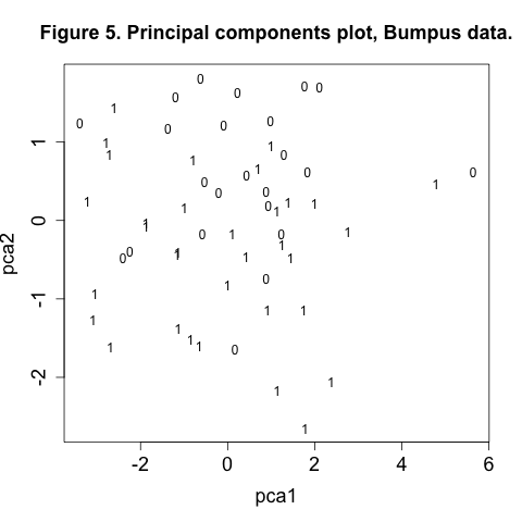
In the call to the plot function we use type="n" (no plotting) to plot empty axes so that we can then cleanly overlay the text labels “1” and “0” for survived and died.
In Figure 5 there appears to more 1’s in the bottom half of the plot than towards the top. We may be seeing an effect of morphology on survival, which sounds suspiciously like natural selection. We can further explore this aspect of the data with our final technique, discriminant analysis.
Discriminant function analysis
Whereas cluster analysis finds unknown groups in data, discriminant function analysis (DFA) produces a linear combination of variables that best separate two or more groups that are already known. This is done essentially by performing a multivariate analysis of variance (MANOVA) in reverse, computing the coefficients of the discriminant function to maximize the multivariate F-ratio. Thus instead of maximizing the total variance explained, as in PCA, discriminant analysis maximizes the total variance between groups. (Go here for further details.)
To compute a linear discriminant analysis using the Bumpus data, first load the MASS package:
library(MASS)
Then issue the following command to compute the discriminant analysis, using the lda function:
dfa <- lda(survive ~ length + alar + weight + lbh + lhum + lfem + ltibio + wskull + lkeel)
The call to the lda function requires a linear equation of the form groups ~ x1 + x2 + .... That is, the response or dependent variable groups is the grouping factor and the right hand side of the equation (to the right of the tilde ~ symbol) lists the discriminating, or predictor, variables. Thus in our example, the grouping factor is the survive variable, indicating which birds lived (survive = 1) or died (survive = 0) following the winter storm. The discriminating variables are the nine morphological features measured on the birds.
Typing dfa will display the basic results:
Call:
lda(survive ~ length + alar + weight + lbh + lhum + lfem + ltibio +
    wskull + lkeel)

Prior probabilities of groups:
        0         1
0.4107143 0.5892857

Group means:
    length     alar   weight      lbh      lhum      lfem   ltibio    wskull     lkeel
0 161.3478 46.56522 6.065217 30.93478 0.7216957 0.7026522 1.114391 0.6020870 0.8420435
1 159.0000 47.27273 5.554545 30.97273 0.7343333 0.7159697 1.128152 0.6005758 0.8566364

Coefficients of linear discriminants:
               LD1
length -0.33400021
alar    0.02024833
weight -0.33627586
lbh     0.33683412
lhum    3.13912588
lfem   43.60134478
ltibio -2.01114374
wskull -8.65410454
lkeel  10.83192985
Prior probabilities are the likelihood of group membership (whether a bird survived or died) based solely on the sample size of each group, with no prior knowledge of the morphological variables measured on each bird. Group means are the univariate means between groups. The coefficients comprise the linear discriminant function used to compute a score for each observation along the discriminant axis.
Typing predict(dfa)$x will list the discriminant scores. With two groups (survived or dead) we get one discriminant axis; in general, n-1 discriminant functions are produced, where n is the number of groups. We can view the distribution of survivors and non-survivors along the discriminant axis by typing plot(dfa):
Figure 6. Discriminant analysis of Bumpus data.
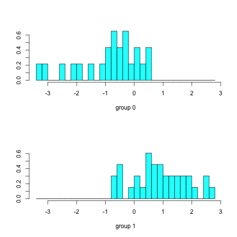
In Figure 6, survivors (group 1) tend to have positive scores along the discriminant axis, while non-survivors (group 0) have negative scores. As with our previous methods we now want to try to interpret the discriminant function, which we do by merging the discriminant scores with the original data and computing correlations:
round(cor(cbind(predict(dfa)$x, length, alar, weight, lbh, lhum, lfem, ltibio, wskull, lkeel)), digits=3)
          LD1 length  alar weight    lbh   lhum   lfem ltibio wskull  lkeel
LD1     1.000 -0.604 0.140 -0.324  0.043  0.383  0.474  0.269 -0.092  0.317
length -0.604  1.000 0.399  0.419  0.015  0.247  0.316  0.104  0.360  0.137
alar    0.140  0.399 1.000  0.359  0.059  0.590  0.572  0.440  0.321  0.323
weight -0.324  0.419 0.359  1.000 -0.048  0.328  0.290  0.306  0.317  0.344
lbh     0.043  0.015 0.059 -0.048  1.000 -0.038 -0.156  0.000 -0.190 -0.130
lhum    0.383  0.247 0.590  0.328 -0.038  1.000  0.782  0.594  0.323  0.320
lfem    0.474  0.316 0.572  0.290 -0.156  0.782  1.000  0.514  0.423  0.371
ltibio  0.269  0.104 0.440  0.306  0.000  0.594  0.514  1.000  0.237  0.334
wskull -0.092  0.360 0.321  0.317 -0.190  0.323  0.423  0.237  1.000  0.227
lkeel   0.317  0.137 0.323  0.344 -0.130  0.320  0.371  0.334  0.227  1.000
As values of the discriminant function LD1 increase, weight and length of birds decrease and the length of several bones increase. As survivors have predominantly positive values along the discriminant axis, one interpretation is that survivors tended to be shorter and lighter (with longer, thinner bones?) than non-survivors and potentially better able to nutritionally survive the severe winter storm of February 1898.
Epilogue
Data is like garbage. You’d better know what you are going to do with it before you collect it. — Mark Twain.
Modern technology is accumulating vast quantities of data at an incredible rate. As noted by Bramer8:
“[S]uch data contains buried within it knowledge that can be critical to a company’s growth or decline, knowledge that could lead to important discoveries in science, knowledge that could enable us accurately to predict the weather and natural disasters, knowledge that could enable us to identify the causes of and possible cures for lethal illnesses, knowledge that could literally mean the difference between life and death. Yet the huge volumes involved mean that most of this data is merely stored — never to be examined in more than the most superficial way, if at all.”
While the multivariate techniques described in this post have been around for decades, they have recently been applied to the rapidly evolving fields of machine learning and data mining. Techniques such as clustering, ordination, and other methods of multivariate statistics can be used to obtain a clearer picture of patterns in big data9 and to help people make intelligent decisions in a world awash in data.
This post has emphasized the practical application of selected techniques of multivariate analysis. The fourth edition of Manly and Alberto’s excellent text Multivariate statistical methods: A primer gives much more detail on multivariate concepts and the methods presented here, including other techniques not mentioned (factor analysis and canonical correlation). In addition, each chapter contains an Appendix presenting details of how to do the analyses in R. The book is highly recommended for those desiring further study.
The Hutchinsonian niche, or
n-dimensional hypervolume. See also Holt, R. D. 2009. Bringing the Hutchinsonian niche into the 21st century: Ecological and evolutionary perspectives. Proceedings of the National Academy of Sciences 106:19659–19665.↩︎Gauch, H. G. 1973. The relationship between sample similarity and ecological distance. Ecology 54:618–622.↩︎
Manly, B. F. J. 1991. Randomization and Monte Carlo methods in biology. Chapman and Hall, London and New York.↩︎
Ludwig, J. A., and J. F. Reynolds. 1988. Statistical Ecology: A Primer on Methods and Computing. John Wiley and Sons, New York, New York.↩︎
See, for example: Ramette, A. 2007. Multivariate analyses in microbial ecology. FEMS Microbiology Ecology 62:142.↩︎
Manly, B. F. J., and J. A. N. Alberto. 2017. Multivariate statistical methods: A primer. Fourth edition. Taylor & Francis Inc.↩︎
Buttemer, W. A. 1992. Differential overnight survival by Bumpus’ House Sparrows: An alternate interpretation. The Condor 94:944–954.↩︎
Bramer, M. 2013. Principles of Data Mining. 2nd edition. Springer.↩︎
Gandomi, A., and M. Haider. 2015. Beyond the hype: Big data concepts, methods, and analytics. International Journal of Information Management 35:137–144.↩︎